
Something troubling has come up for me in the last couple of weeks when visiting galleries.
It's when venues let the exhibition get in the way of the show—or rather, don't make the accoutrements of the exhibition subtle or invisible enough for the work itself to shine through. Basically, I'm talking bad framing, smudged walls, skewed labels and the like—there seems to be more of it now than I previously recall, and it's not a good thing for the Toronto art scene.
Now, I'm admitting to this irritation with no small degree of dread. To complain about things like the use of cut-up Avery labels instead of numbered stickpins, or about the choice to use glass frames rather than mount to Plexi—well, these are the types of niggling complaints that give many critics a (deserved) lily-livered reputation in the popular milieu. It all seems very Princess and the Pea, no? (It's a far cry from learning to ignore barrelling logging trucks on a cycle-camping trip down the Pacific Coast Highway, I can tell you that!)
Nevertheless, I must note two exhibitions I've seen that disappointed due to the small details of installation and presentation not being considered and attended to.
The first instance of this is Katsuhiko Mizuno's "Four Seasons in the Garden of Kyoto" at the Japan Foundation. When I saw related images in the brochure and on the web, I was quite looking forward to seeing this exhibition. As I've noted here previously, there's a city worker's strike in Toronto right now, with a few weeks of garbage piling up in public parks and private backyards. The result is a stinky urban soupcon that makes the prospect of escape into placid images of Zen gardens all the more appealing.
Unfortunately, all the prints in this show are relatively small (around 11" by 17") and mounted behind glass in such a way that one's reflection is continually at odds with visually entering the picture. I get that of course these kinds of reflections are what some works of art are actually about. But in this case, they're not appropriate. This show would have worked much better if: (a) the images were mounted on Plexi and/or lit correctly to avoid intrusive reflections; (b) the images were printed much larger; (c) audio from two related documentary films wasn't blasting through the space—headphones please!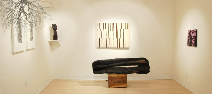
The second instance of this phenomenon I encountered at Miriam Shiell Fine Art and her show "Wood and Ash." Now don't get me wrong, there is some quite nice (and big-name) work in this tree-themed show—the Lee Friedlander prints are really great, the David Nash sculpture is interesting, and, strangely, it's nice to see Janet Cardiff and George Bures Miller's work House Burning in a commercial group show context. Zang Huan and Angel Marcos's images are also intriguing. It's just that, for one, the space is very awkwardly arranged, with a bench right by the Nash sculpture that I'd say steals its fire somewhat and further cramps an already cramped space. Also, this is where the label issue irritated me the most, with large paper-sticker numbers that seemed strangely obtrusive. How hard is it to order some stickpins?
A third instance of this I already described a bit in relation to the George Ohr show at the Gardiner Museum. While that exhibit is laid out fine, the contemporary collections area is looking a little shabby—video booth dark and dysfunctional, walls smudged and even written on.
Do you think exhibition standards are dropping? Is it the recession? Depression? Someone please tell me.
Middle image from Japan Foundation Toronto; last image from Miriam Shiell Fine Art; Neither of these, unfortunately, look as good in person
Wednesday, July 8, 2009
When the Exhibition Gets in the Way of the Show
Subscribe to:
Post Comments (Atom)

1 comment:
It is good to have a gentle reminder that those little exhibition details count. In our rush to get exhibitions hung, it is easy to overlook things that our visitors do notice and do pick up on.
I used to be obsessive about completely painting the gallery between shows, but have realized that sometimes it is just not feasible. However, it is a good reminder that others do notice when we don't.
The labels vs. stickpin issue is something that I wrestle with. Personally I love the no labels look, however, not everyone feels comfortable in galleries and I want to make the gallery experience as easy and informative as I can. Therefore, I have opted for clear labels that provide basic information together with the price.
Thanks Leah for reminding us that the little details count. We want our gallery visitors to look at the art, not notice bad paint jobs, obtrusive labels, a dirty floor, burnt out lights, or badly hung artwork.
Post a Comment