

Sometimes you learn a heckuva lot from researching just one article. Actually, this is often the case.
But I feel I learned more than I usually do in researching Canada's first-ever exhibition of North Korean art, which opened at the University of Toronto Art Centre this month. My resulting article was published yesterday in the Toronto Star, with an expanded version online at thestar.com. Here's an excerpt:
With its reputation for Stalinist repression, North Korea's image in the West tends to be an ugly one. But a current Toronto exhibition is offering a rare look at this mysterious nation's more beautiful and artistic side.
“North Korean Images at Utopia's Edge,” on display at the University of Toronto Art Centre, is the first exhibition of North Korean art in Canada. Its 24 linocut prints are drawn from the collection of Nicholas Bonner, a U.K.-born, Beijing-based architect, tour operator and filmmaker who's visited North Korea monthly since 1992.
“The problem in the West is we have our own preconceptions of what North Korea is like,” Bonner says over the phone from his Beijing home. “I know how strongly the North Korean public wants to have exposure to the West, and it's just as important for us to get a sense of where they're coming from. That's what drives me.”
“Utopia's Edge” is just the latest instance of Bonner's aim to bridge cultural gaps between North Korea and the rest of the world. He's created award-winning documentaries on North Korea's soccer teams and U.S.-military defectors, and amassed more than 1,000 pieces of North Korean art in demand for exhibitions overseas.
Bonner, a kind of unofficial cultural liason between North Korea and the West, has also worked the cultural-exchange equation the other way, helping bring screenings of Bend it Like Beckham and performances by the New York Philharmonic to North Korea's capital city, Pyongyang.
Another thing I wanted to include in the article, but which was trimmed, addresses the difficulty of facilitating these kinds of exchanges given the sanctions that many Western countries maintain against North Korea. For example, Bonner tried to bring six North Korean artists to Australia last year for the Asia Pacific Triennial, where he had co-coordinated an exhibition of their art with the Queensland Art Gallery. Though the artists were given the go-ahead to travel by the North Korean government, Australia's government barred them from entering. (Their art was still exhibited, however.) There's some fascinating coverage of this issue here and here.
Bonner also told me over the phone that he had, in the past few years, been trying to arrange a visit by a North Korean artist to Canada, a proposal that was ixnayed by the feds, whose current engagement policies with North Korea forbid "cultural exchange."
In any case, one of the upshots of the Asia Pacific Triennial exhibition is that Bonner and his co-curator, Suhanya Raffel, managed to get the North Korean artists to try some different approaches to their subject matter--approaches that are more "humble" than "glorifying" of North Korean life. Bonner discusses these works in part 3 of his triennial talk, embedded below and also viewable at the Queensland Art Gallery's Youtube Channel. (Can more Canadian galleries facilitate posting artist and curator talks this way, please?)
I have no idea what drives Bonner so strongly in regard to North Korea, but you can find out more about him (and about the country) at his Koryo Tours site or this interview with the Beijinger.
Also, if you want to know more about the way art is produced in North Korea--ie. in state-run factory/studios of up to 1,000 artists--check out Adrian Dannatt's 2009 article from the Art Newspaper or go to the UTAC symposium on Thursday... it features Jane Portal, who's currently based in Boston but who basically built the Korean art collection at the British Museum and who's also authored a key text on North Korean art, "Art Under Control."
Given all the news of famines, missiles and warship attacks, I can see why North Korea has a bad reputation among many states. But I'm glad there's this opportunity to consider what art and beauty might mean over there too.
(Image of Jong Gwan-Su's Propaganda Van Girl "2.7 Times More than Planned", 1988 courtesy Nicholas Bonner, the Korea Society and UTAC)
Monday, January 31, 2011
Loyalty to Art, and to the State: Canada's First Exhibition of North Korean Art Now up at UTAC
It's a Jungle Out There: Reviews of Some Wild Shows from this Weekend's Post

Sometimes I wonder about that age-old question: Does every critic, at heart, really yearn to be a curator? I know I'm really bad with space and objects and such, so that's not such a great fit for me. But y'know, I can't resist a good theme--linking art together that way is certainly up my alley sometimes.
So it goes with my At the Galleries column for this weekend's National Post. Though the column is usually neighbourhood-focused, I couldn't resist discussing a few shows across the city that deal with the theme of (or include) animals. The zoo-ish tour took me to Ingram Gallery, Katharine Mulherin and QueenSpecific. Here's an excerpt:
Bodies & Politics at Katharine Mulherin
1086 Queen St. W., to Feb. 6
Ontario-raised, New York-based artist Michael Caines wittily takes on the political animal in his recent paintings, showcased in this three-person exhibition. These meticulous canvases show a Jesus-like Reagan cuddling a Glenn Beck lamb, a childish Nixon playing with kittens, and a ruby-slippered Karl Rove wandering a fairytale forest, Bambi in tow. Though conservatives could be upset by the uncertain implications, Caines’ dexterity and Honoré Daumier evocations will likely seduce most viewers. Elsewhere in the show, Balint Zsako’s remarkable recent watercolours offer a different take on human-as-animal. In them, human flesh, milk, blood and tears become transformative imagery for narratives that are at once primal and uplifting. (In these images, art and romance are the two things that seem to differentiate us from the other mammals kicking around.) Finally, the dark, Goya-esque drawings of Oscar de las Flores picture a more dog-eat-dog angle on civilization. Overall, highly
recommended.
You can read the rest here at the Posted Toronto blog. I know I'm reading in some of that animal stuff... but I guess that's the good part of being a critic, not a curator.
(Image of Michael Caines' Cats vs Dogs 2010 via the National Post courtesy Katharine Mulherin)
Friday, January 28, 2011
Double-Yellow-Dot Delights: Q&A with Elliott Wilcox in today's National Post

I grew up in a squash-playing family, so when I saw UK photographer Elliott Wilcox's shots of racquet-sports courts, there was some serious punctum going on for me. Others think Wilcox's project is pretty cool too--he's won some awards in the past few years, and also appeared on the BBC's School of Saatchi reality TV show. Recently, I got to chat with him on the phone about his practice. The resulting condensed Q&A was published in today's National Post. An excerpt:
Q I grew up in a squash-playing family, so these photos have nostalgic value for me. What drew you to this topic?
A When I first started, I wanted to look into something that hasn't been looked into in photography so much--the idea of leisure. A lot of photography in England has looked at work. But I was interested in what people wanted to do in their own time, at their most comfortable. So I started looking at spaces of leisure, from football grounds to cinemas. Through that I got into squash courts and real tennis courts.
Q The marks left on the walls of these courts are fascinating, almost like drawings, aren't they?
A They look amazing. I love the fact that it's history on the wall itself--the history of the game and of the people who have played. There's a great sense of time on the walls. One of the real tennis courts I photographed in the south of England was made in the 1700s with a special pigment. It creates a really painterly effect.
What I'm fascinated by even more is the large space of these courts. It can be very overwhelming, especially when there's nothing else going on. When there's people there playing, it's about the sport. But when you're a spectator only of the space it becomes something completely different.
A lot of these clubs are also prestigious. Queen's Club in Notting Hill is where lots of people play before Wimbledon. When I photographed their rackets court they'd just had it painted, and the members were upset because they thought the paint would make it play differently. That fascinated me, because you wouldn't think paint would make a difference. But if you've been there so long, maybe it does.
You can read the rest of the interview here and see more pics here. Wilcox's first Canadian solo show continues at Bau-Xi Photo in Toronto to January 29.
(Image of one of Elliott Wilcox's squash-court pics from Lenscratch)
Thursday, January 27, 2011
Words, Pictures, Etc: Ron Terada Article Out in Today's Toronto Star

Words... pictures.... why do I even bother trying to make these puppies fit together? I'm not really sure. Art criticism (and sometimes art itself) is weird that way, trying to use one genre of expression to describe another. Not quite hopeless but not quite as worthy an endeavour as I once thought it was, I guess.
Such is the navel-gazing that stupefies my brain as I consider my article on Ron Terada's current Toronto show that was published in today's Star. Like, 20 years of work, 700 words to compress it into, let me try and level these things out. I don't really think I did the greatest job. But it was fun to talk with Terada, and, as usual, the privilege of talking to the artist helped me understand the work a lot better than I thought I might have. An excerpt:
For someone with an exhibition titled “Who I Think I Am,” Vancouver artist Ron Terada is surprisingly reluctant, at first, to be photographed. Granted, the Star’s photo session is a last-minute surprise and Terada ultimately warms up to the idea.
Still, one wonders: Amid all this self-referentiality, where is Terada’s, erm, self?
Sitting in Soundtrack for an Exhibition, a pseudo rec-room artwork with a playlist ranging from Urge Overkill to Vampire Weekend, Terada explains that he sees identity as more composite (and indeed mixtape-like) than a single-shot deal.
“A lot of what I’m interested in is content that exists outside of myself,” he says. “But by selecting or acknowledging content, or elevating it, it says something about you. So does the stuff that you reject. The choices you make determine who you are.”
Accordingly, “Who I Think I Am,” a solo exhibition at Barnicke Gallery, highlights some of the key choices that have defined Terada over the past 20 years. There’s the large-scale canvases of gallery ads that launched his career in the early 1990s, just a couple of years out of Emily Carr Institute of Art and Design. There’s the forays into industrial signage, like 2002’s highway-side Entering City of Vancouver and the 2003 neon logo Big Star. And then there’s Jack, a series of minimal 2010 paintings that reproduce the notoriously frank memoirs of late, troubled L.A. artist Jack Goldstein.
You can read the rest of the article here.
Here's a couple of things I thought were interesting that I didn't manage to get into the article:
1) Leah finally has her "aha" moment with Terada's Entering the City of Vancouver signs! As Terada explained to me, the sign of course references ideas of Vancouver art, or art ideas about Vancouver, among other things. And the idea of reproducing the sign is "You don't have to enter into it. You can reject it. You can turn around and walk away from it. All it is meant to be is a boundary marker so you can decide whether you want to go there or not." Got it now.
1a) Interestingly, Terada points out in the show (by using reproductions of these signs rather than the sculptural version) that his Entering the City of Vancouver work has become a bit of a sign for Vancouver art in itself. There's a lot of this double-edged quality in his work, of creating something that is both a continuation and a critique of its source material, both inside and outside.
2) The catalogue for this exhibition is supercrazy. In keeping with Terada's somewhat appropriative oeuvre each page borrows its design from a photograph of a page of a different art book. Fonts, picture sizes and such are matched to the source document even as the actual text and images themselves change. I highly recommend checking it out, especially if you are a design nerd. Looks like a crazy amount of work.
If you want to go see the show--it's final stop after Banff and Birmhingham--it's up to March 20 at the Barnicke.
(Image of Ron Terada's The Words Don't Fit the Picture--actually not in the Barnicke show--from the City of Vancouver)
Wednesday, January 26, 2011
The Art of Transit: Newish Public Art Hits St. Clair TTC Line
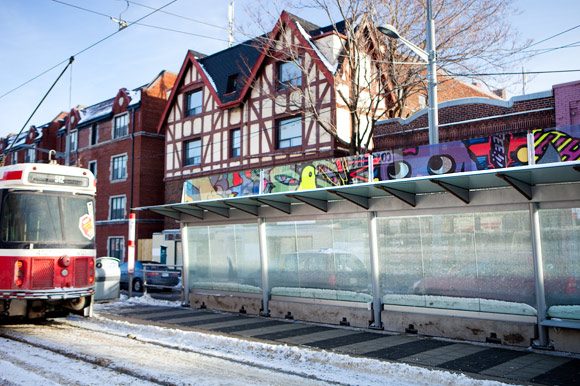
I know I just did an article looking at light-based public art in Toronto, but one of the brightest public art ideas I've seen of late has been the newish installations along St. Clair West TTC shelters in Toronto. Toronto-centric site Yonge Street Media asked me to take a look at them back in December, and I'm so glad I did--the variety of artistic approaches is really pretty amazing considering the limitations of the format.
The resulting article was published today on Yonge Street's site. An excerpt:
For years, the corner of Oakwood and St Clair -- like many Toronto intersections -- has relied on commercial signage for injections of colour and identity. On most grey winter days, the blue and white of a Mac's sign, the purple serif of a second-floor Curves and the fire-engine-red of a Scotiabank logo are the only things that have stood out in a sea of brick and concrete.
But recently, all that changed when a bright, 40-foot-long artwork appeared on the intersection's eastbound TTC shelter. Packed with comic-book references and graffiti-esque doodles, the piece adds fun to a place that has long tended towards function.
This new addition to the streetscape, created by multitasking Queen West artist Mark Laliberte, is one of 24 vibrant artworks that were installed on top of St Clair TTC shelters at the end of November. From Yonge to Keele there's a surprising range of work by 21 artists—from Judith Schwarz's intricate metalwork and Sally McCubbin's glass cityscapes to Sarah Nind's Sidewalk Tango photographs and Panya Clark Espinal's Spirograph-inspired mixed media.
Another thing I really liked about this project is that it brings some previously gallery-only names to city streets, allowing traditionally "indoor" artists to try doing a permanent (or at least 20-yearish) outdoor installation. These types of artists going public for the first time on the St. Clair West line include Kristan Horton (who played on public art as infrastructural "icing"), Sara Graham and more.
Though the weather has been far from conducive of late for a public art jaunt, I highly recommend checking these out when you have the time. They run somewhat erratically along the St. Clair line from Yonge to Keele.
And yes, I was told that these installations come out of the TTC's own Percent for Public Art program, which sets aside 1% of construction costs for art. This is not to be confused with the City of Toronto's Percent for Public Art program, which is used separately with private developers on a noncompulsory basis. You can also check out news of upcoming art installations for future subway stations here on the TTC's site.
(Image of Mark Laliberte's St Clair West project snapped by Tanja Tiziana for Yonge Street Media)
Thursday, January 20, 2011
Am I Kai Chan Crazy? Yes, Yes I Am.

OMG, am I Kai Chan crazy? I have realized, looking at all that I have written about his work in the past few years, that I must be. The latest iteration of this (and, I promise, in the name of balance, my last word on the subject for some time) is a condensed Q&A with the artist, out in today's National Post. An excerpt:
Q You studied biology and interior design. How did you start making art?
A I always wanted to become an artist. But it wasn't until I saw the 1969 Wall Hangings exhibition at MoMA that I just went, "Wow! Thread and textile can be a very expressive form." Somehow I feel very close to textiles. I think because I grew up in the countryside, and everything was handmade and textile was obviously part of the environment, I feel very comfortable with it.
So after I came back from New York I started to imitate that kind of textile art. But I had no training. I just went, "Oh, here's some threads and I'll mix them all together!" Ha! That's how I started.
Q You've written that traditional art materials can't express your views. Why not?
A Well, I think bronze sculpture and that kind of thing is just so alien from our everyday life. But when I'm working in the kitchen, I look at the things I'm throwing away and I think, "This could be very beautiful material. Why doesn't anyone use it?" Like a garlic stem, which I use in some of my pieces. And leaves, and grass. We have a little backyard that has trees and I prune them every year. Then one year I went, "I can't just throw these branches out!" So I began to use them.
There can be other sources for my materials, too. Following up on that Wall Hangings show 40 years ago, I found a Toronto sock company that was closing. So I bought their entire thread stock. I'm still using some of that. Another time, in Quebec, I asked locals to donate buttons. There were tons and tons! Buttons have a beautiful shape but also have lots of history because they depend a lot on fashion. I've made three or four works with those. More recently, I've used this red silk thread from Tibet, where I was one year. It's a thread Tibetans braid into their hair. I saw it in the market and just loved it. I bought a few bunches and said, "I need to use this for something."
You can read the rest of the Q&A here.
In terms of extra tidbits that I enjoyed but which didn't make it into the final interview, I liked hearing from Chan about some of the twists and turns of his career--like losing his interior design job, which prompted him to start a satay restaurant across from OCAD with some friends in the early 1980s, which in turn gave him an extra day a week to work on art. It was also interest. Another point I'm sure other artists will be interested in: though Chan's work has differed a lot from what other artists (or craftspeople) have been making in Canada through the years, there were often one or two sources outside the country who kept encouraging him in his work. For example, he once informally made jewellery for a party he was throwing for a visiting artist, which someone suggested he send to a juried show of nonprecious jewellery in the UK, which ended up being one of two Canadian works in the show.
It's all to say that Chan has had a very varied career, yet it's remarkable how his material practice has remained, in a way, very meditative and focused. The show is up at the Textile Museum until May 1 and at the Varley to January 30.
(Image of Kai Chan's Red Flood from Canadianart.ca)
City of Lights: A Tour of Some Public Art in Toronto

A few weeks ago, the Toronto Star asked me to try and devise a little tour of public art in the city that lights up our long, dark winter nights. It was a real learning experience for me as I was previously unaware of just how many artworks--particularly ones developed under the Percent for Public Art Program--have been using the LED medium in recent years.
You can read the resulting tour today in the Star's Entertainment section. An excerpt:
Mitosis Courtyard
Pierre Poussin (2007-2010)
Cityplace Panorama, 38 Dan Leckie Way
Toronto’s Poussin first trained as a biochemist, and it shows. These two-dozen columns, with circular patterns inspired by cell division, come across a bit as orderly, phosphorescent mushrooms. The result? An unlikely sense of play and enjoyment brought to the dark underbelly of the Gardiner. Granted, litter around the courtyard means some of the underpass’s dinginess remains, but it’s a great example of how art and design could grow good vibes for this overlooked zone in the future.
You can read the rest of the tour here. A couple of clarifications I'd just like to add to the overall piece:
-The Percent for Public Art Program isn't a compulsory program for private developers in Toronto. Though PPAs can be compulsory in some other cities, the way it works in Toronto, from what I understand, is that it is most often implemented as part of community compensation for a given developer's height- or zoning- or density-variance requests.
-The ratings that I offered for each piece reflect my experience of the work in nighttime. So this was most difficult for me to do when it came to the new Ed Pien work at Wellesley-Magill Park. I love Pien's gallery work, and by day I loved seeing how this piece brought techniques and images he usually conveys with fragile paper cutouts and tranfers them onto a heavy, durable steel medium. I also really loved seeing his work at such a large scale. But... at night I found the lighting element wasn't really sufficient to draw viewers in or give them a good sense of the imagery. So I reluctantly gave it a lower "night rating" even though, as I explain in the piece, the darkness of the lighting makes sense in the context of Pien's content and past work.
-The cost listed for each work is approximate, is privately funded, and covers everything from calls for submissions to jurying to construction and fabrication to artist fee.
Anyway, those were just a couple of notes I wanted to add. Any favourite public artworks of yours in the light realm or otherwise in Toronto? Feel free to share. If I learned anything from this piece it's that I haven't seen half of the public art stuff that's going on in Toronto.
(Image of Pierre Poussin's Mitosis Courtyard from World Architecture News)
Wednesday, January 19, 2011
Q&A with Kelly Richardson out in today's National Post

Dali meets The Day After Tomorrow in the surreal, CGI-laden films of Canadian artist Kelly Richardson. And many in the art and film worlds are taking notice. Tomorrow, excerpts from Richardson's latest work, The Erudition, screen at Sundance's kickoff fundraiser, An Artist at the Table. Last week, the full three-screen version of Erudition also opened for a two-month run in Lethbridge, with smaller versions showing in Toronto and Halifax.
Amid all this activity, Richardson is also just about to start a residency at Artpace in San Antonio, so I felt very thankful that she was able to squeeze in some time to chat with me over the phone about her work this weekend. She says on Twitter that "I could have been more eloquent but exhaustion had kicked in." Nonetheless, I take all responsibility for any lack of eloquence in the condensed Q&A that resulted, which is out on today's National Post. An excerpt:
Q You show mostly in art galleries. What's it like to be recognized at Sundance?
A It's great, and still a little unbelievable. I suspect Sundance has a very different crowd than might go to contemporary art galleries. It's nice to have that crossover to a wider audience.
Q What has the impact of mainstream movies been on your art?
A Massive. In the past seven years, the special effects in disaster films have really influenced me. It's not so much the storylines, but the money shots that I'm seduced by --like in The Day After Tomorrow where there's the great flood and then it freezes over, shown in all these epic landscape shots. Increasingly, I'm influenced by science-fiction movies, too. I love their ability to take you into a possible future; in that way, they provide a rare vehicle for seeing your present environment with a measure of hindsight. I guess Avatar would be a good one to reference now. The Lord of the Rings is another obvious pick.
You can read the rest of the Q&A here.
One thing I failed to squeeze in (among many) was that Richardson often spends months learning new software for each piece she produces. The only formal course she has taken in digital filmmaking and effects was a course on Final Cut Pro in Toronto in "1999 or 2000." That's a lot of self-teaching, folks.
Richardson also told me (and it may be no surprise to those who work with effects, but it was to me) that it can take months for the effects in her films to render--meaning, push the button and let the computer do its processing work time. I'm such a hardware naif!
If you want to see Erudition in person (and, ahem, haven't got a ticket for a sold-out Sundance funder) excerpts are up to January 31 at Birch Libralato in Toronto and April 26 at the Art Gallery of Nova Scotia, with the big, real deal on view at the Southern Alberta Art Gallery to March 6.
(Still from Kelly Richardson's The Erudition from the SAAG)
Monday, January 17, 2011
Wanna Talk Art Writing? Articulations Workshop in Ottawa February 19

Wanna talk art writing? In Ottawa? In February? You're in luck! I'm leading an Articulation workshop at the Ottawa Art Gallery on February 19. Here's the details:
Leah Sandals Articulation Workshop
Ottawa Art Gallery
Saturday 19 February 2011
10 am to 4 pm
(Workshop in English)
Deadline for registration: 11 February 2011
This practical seminar will lead participants through activities on a few aspects of professional art writing: generating raw material, identifying potential publications and story formats, pitching story ideas, freelancing, and self-editing. The increasing options in self-publishing will also be discussed, and time will be reserved for participant questions and input.
$40 per workshop ($32 for students and OAG members)
For registration and information:
Marie-Camille Lalande
613-233-8699, ext. 228
mclalande@ottawaartgallery.ca
Later in the season there's sessions with Marie-Eve Charron and Barry Ace, both worthy outings too. And another interesting tidbit: the gallery is planning a move in the next few years.
(Ottawa map image from the Ottawa Art Gallery - conveniently located a short walk from the Parliament buildings! A Canada-loving joe like me still gets excited about such things.)
Awards-Season Art Reviews from the Weekend Post

Didja see the Golden Globes last night? I did a wee bit, until the boring speechifying changed my mind. Nevertheless, this beginning of the film awards season made me think recently of the "marquee shows" at some Toronto galleries. I reviewed three in this weekend's National Post: Maharaja at the AGO, Abel Abdessemed at Onsite [at] OCAD and Tim Burton at the TIFF Lightbox. An excerpt:
Maharaja at the Art Gallery of Ontario
317 Dundas St. W., to April 3
With Maharaja, the AGO has finally managed to do a historical exhibition right. Sure, King Tut and Drama & Desire also had lots of stunning objects. But those past shows lacked sufficient interpretive material — texts, videos, etc. — to provide stories and contexts for the objects on view. Whether it’s thanks to London’s Victoria & Albert Museum, which organized Maharaja, or thanks to the AGO itself, this exhibition suffers no such downfall. It’s a delight to see these finely crafted paintings, ornaments and furnishings, and it’s also a delight to learn about the time and place they represent. We discover, for instance, that 1700s court paintings weren’t displayed on walls; rather, they were viewed in private portfolios. Similarly, a long painting of a procession (one of many great parade scenes in Maharaja) is annotated to pinpoint various faiths and classes of 18th-century India. All this, of course, may seem mere detail. But as the many finely cut gemstones in this exhibition evince, attention to detail (and not just to sparkle) is what makes a real jewel.
You can read the other two reviews here.
(Jawan Singh of Mewar Hunting Boar, 1835, via the National Post)
Toronto Biennial Report & Plan Released At Last

Further to my whiny December post about the extreme lateness of a Toronto Biennial forum report overdue to the public from MOCCA and the Power Plant, I received notice today that a summary report is now available as a PDF at http://www.thepowerplant.org/News/Report_FORUM_17April2010.pdf.
Penned by Power Plant director Gregory Burke, Power Plant curator Jon Davies, independent critic/forum moderator Peggy Gale and MOCCA director David Liss the summary concludes:
Based on the interest and enthusiasm of many participants at the [April Toronto Biennial] Forum, we recommend that we move forward with developing options for staging a recurring international contemporary art event in Toronto and that options should:
1. consider the intricacies of the current funding situations in Toronto, Ontario and Canada, and questions of who the audiences are for such an event.
2. recognize both the specificity of Toronto and its specific communities, histories and cultural legacies.
3. recognize the leadership, capacity and diversity of the contemporary art infrastructure in Toronto and the role of artists and artist-run culture in creating Toronto’s rich cultural landscape and history.
4. reinforce that the event must be ideas driven and must put forward a distinctive argument on contemporary art production both in Canada and internationally.
The core leadership group will continue consulting with the art community and aims to present a number of options to an open meeting in Spring 2011 for response.
I'll look forward to seeing what form this spring meeting about "moving forward" takes. Also, this summary excludes a lot of the day's discussion. If you want a full description of the day’s events, one is promised to be available by email from Robin Boyko at rboyko@harbourfrontcentre.com.
(Note-taking image via Mahalo.com)
Monday, January 10, 2011
Cross-Country Winter Arts Preview @ the National Post
This weekend, the National Post published a cross-country winter arts preview covering books, music, TV, movies and art. I supplied the latter picks. Here's a few of my picks that were in print but aren't up at the Post's site:
Nuit Blanche and Art Souterrain in Montreal
Though it’s widely regarded as a good-times town, Montreal’s more hardy than party in holding its annual all-night arts fest during frigid February. Ferris wheels and fireworks not enough to lure you outdoors? That’s okay; the arctic wind’s blow is softened by lots of indoor activities, notably Art Souterrain, an exhibition that launches on Nuit (February 26) and takes over the downtown’s many underground tunnels, malls and metro stations until March 13. This year features an all-Nuit screenprinting workshop, photos by Isabelle Hayeur and more. Watch for the full Nuit schedule available early next month at http://montrealenlumiere.com—with fingers crossed for a redo of last year’s Opera Karaoke!
Thomas Hirshhorn & Iñigo Manglano-Ovalle at the Power Plant, Toronto
On March 12, the Power Plant opens a newly renovated space and (hallelujah!) revamped website. Its main draw, though, is its concurrent North American premiere of Swiss artist Thomas Hirschhorn’s The Eye, a 3,600-square-foot installation that features Hirschhorn’s characteristic mix of philosophical ideas and flimsy materials. (The premise: an eye that can only see red. Yes, colour photocopies and stuffed animals are involved.) Spanish-born, Chicago-based artist Iñigo Manglano-Ovalle also brings the brainpower with reproductions of the supposed “mobile biological weapons labs” that Colin Powell invoked prior to the US invasion of Iraq. Originally produced for Documenta 12, Manglano-Ovalle’s ersatz trailer will be featured alongside Hirschhorn until May.
Online Art for Anytime and Anywhere
Eat your heart out Mark Zuckerberg! Several Canadian artists and arts orgs are determined to use the web for higher creative ends. Leading worthwhile winter browses are geek-tech videos by Toronto’s Jeremy Bailey (http://jeremybailey.net/), who’s performancing at Tate Britain on February 18. Melanie Gilligan (born in T.O., based in the UK) has earned a stratospheric rise of late with her socially conscious dramas http://www.popularunrest.org/ and http://www.crisisinthecreditsystem.org.uk/. Don’t miss Alberta’s Cedar Tavern Singers, who sweetly sing and dance about art history at www.thephonorealistes.com. And for variety, try AGO’s Art of the Day Tumblr (http://artgalleryofontario.tumblr.com/) as well as the Canuck-created curated video site Ryeberg (http://ryeberg.com).
For my other Canadian winter art picks--including Brian Jungen's surprising change (or at least inversion) of tune at Catriona Jeffries and other BC highlights--read on here.
(Video of Jeremy Bailey performing public sculpture in Kiev, Ukraine from Youtube. If you want to get the background on this project, check out another of his videos here.)
Thursday, January 6, 2011
Why the AGO and the ROM are starting to look alike: Out in today's Star

Some people I think feel it's a little tightassish to be calling some exhibitions "a ROM-appropriate show" and others "an AGO-appropriate show." But I know that I felt confused at first when I saw the AGO showcasing King Tut and the ROM showing stuff like Shanghai Kaleidoscope soon after their respective reopenings. They seemed to be crossing over into each others' traditional territory, basically.
Recently, the Toronto Star asked me to take a closer look at the way these "crossovers" have developed. The results are out in today's paper. An excerpt:
[U of T museum studies professor Lynne] Teather identifies three factors on the local level that have caused mandates to overlap at the city’s top museums: the museum directors’ priorities; increasing desires to connect with Toronto’s diverse communities; and daunting post-reno financial constraints.
Conversations with AGO and ROM reps bear out Teather’s observations — with some interesting twists.
Francisco Alvarez, managing director of the ROM’s Institute for Contemporary Culture, says William Thorsell’s recent tenure as CEO beefed up the ICC — and, by extension, the museum’s shows of contemporary art.
“Thorsell thought that with a very contemporary architecture (Daniel Libeskind’s Crystal) we were promising considerations of contemporary issues,” Alvarez explains. Although the ICC was born in 1989, it was only in 2007 that it earned a dedicated staffer, space and board. The result, Alvarez argues, are art exhibitions that have an anthropological edge, with the Perjovschi show pointing to Romanian history and the Anatsui exhibition being supplemented by a panel on Africa’s natural resources.
Elizabeth Smith, executive director of curatorial affairs at the AGO, says its big, surcharged exhibitions aim “to vary the program with the idea of reaching as broad an audience as possible. In the case of Maharaja, the idea was to appeal to the South Asian community as well as a more mainstream public.” Smith notes smaller, general-admission AGO exhibitions have different criteria, like in-house curator preferences and collections. For example, the recent survey of artist Julian Schnabel emerged from AGO curator David Moos’ interests.
Later, Alvarez mentions that the ROM passed over the Tut show in part because they weren't allowed to add any curatorial material or artifacts for a Toronto showing. That explained a hell of a lot, given that when I went to see Tut at the AGO, I was baffled as to why there was no information on the "artists/artisans" who created these objects, or much information about the materials of the objects, the way they were made, and where they were found--stuff I might expect in a more art-contextualized show. (Or hell, maybe just contextualized show, period.)
While this article naturally only scratches the surface of why these programs have evolved in the way they have, I also appreciated Alvarez and Smith's generosity in speaking to the point of "art vs. artifact--is there any difference anymore?" Their reponses made me consider more than ever is the way cultural context can affect these definitions. When we look at the history of Western "art," there's many objects (sculptures, paintings, what have you) that were created to fulfill a specific purpose--like teach the masses about Catholic-church doctrine, or glorify the papacy or royalty.
And yet, when you ask people what an artifact is, they often say it's an object with a purpose or utility--something distinct from art, which is a "pure" personal expression of the artist. In that case, though, many "treasures of Western art" should be classified as artifacts to my mind, seeing as how they were basically advertising or tools for propaganda (or, to be less dogmatic, "education"). Or, we could say, they were used for religious or "tribal" purposes of their day--not unlike many of the non-European masks, vases and architectural details we see classified elsewhere as "artifacts."
Anyhoo, I know all those divisions are pretty null anyways. As Teather explained, museums tend to use a "specimen" approach these days--where all objects (and even nonobjects) are regarded as tools with which to tell a story or impart information--whether you want to classify that information or story as artistic or not.
(Detail image of El Anatsui's work from the Toronto Star)
Monday, January 3, 2011
Holiday Catchup: The Shows I'm Looking Forward to in 2011

Happy new year! Just catching up on an item of mine that the Post published over my holidays last week. It's about Toronto shows I'm looking forward to in 2011. An excerpt:
For the Torontopians Some of the most anticipated 2011 shows highlight Toronto talent. Leading the local-pride parade is MOCCA’s This is Paradise, a tribute to the Queen West and Cameron House scenes opening June 23. On February 4, MOCCA also launches a solo exhibition of internationally recognized (but often overlooked) artist Luis Jacob. (Jacob’s book Commerce by Artists will also be released soon by Art Metropole.) Absolutely must-see is a survey of renowned feminist photographer Suzy Lake that opens at the University of Toronto Art Centre (UTAC) as part of CONTACT this spring, while the ROM’s CONTACT offering is Edward Burtynsky and his touring, decade-long mega-project on the oil industry. Lots of smaller dealer shows also tempt: Marla Hlady’s sound sculptures opening at Jessica Bradley on Feb. 26; a large installation by An Te Liu at MKG127 starting April 23; up-and-comer Morley Shayuk’s first solo at Paul Petro beginning June 11; and Canadiana-kitscher Maura Doyle’s Petro show starting Oct. 14. On the public-art front, a larger-than-life James Carl sculpture will be installed near the TIFF Lightbox this summer, while Nuit Blanche, happening Oct. 1, has terrific curators tapped: St. Catharines’ Shirley Madill (who organized 2010 smash David Hoffos), the roving Candice Hopkins (known from coast to coast as a fine First Nations curator), and Toronto’s Nicholas Brown (who highlighted new talents at Red Bull 381 Projects). Jon Sasaki at the AGO in April should also be fun.
A few notes: Someone (correctly) pointed out to me over the holidays that Luis Jacob isn't as overlooked municipally as some might opine. I should have noted that Sasaki show is part of the Images fest. Also, one of many items I unfortunately cut for compression along the way is that the Toronto Sculpture Garden is turning 30 this September! They have vaguely promised something big to celebrate, though nothing specific to confirm yet. Still, I look forward to it. It's a pretty great little public art space.
You can read on here for my Canadian-art and international-artist picks confirmed to be in town as well in 2011, and feel free to post comments about anything you're looking forward to seeing.
(Still from UK artist Lindsay Seers' Extramission 6, which will be showing as part of Images in April at Gallery TPW.)
