Friday, December 24, 2010

Happy Holidays!

I think even my computer wants me to start my holiday, because it auto-published this post a few times before I even typed anything.... soooooo.... HAPPY HOLIDAYS! Or just at least HOLIDAYS!!! I hope ya'll get some time off. I'm planning on trying to take off until January 3. If you're in dire need of online art fellow-feeling in the meantime, I recommend the following:

See you in the new year!

(Image of SWA Group's Chainsaw MassACRE installation from InHabitat)

Read More......

Monday, December 20, 2010

Of Crochet and Cartoons: Q&A with Shannon Gerard out in today's Post


Toronto artist Shannon Gerard won international attention a few years ago when she decided to crochet life-size "dinks and boobs" as cancer-detection training tools and general cancer-awareness raisers. And she won further local Toronto attention with the project when a university bookstore had a related display removed from its store.

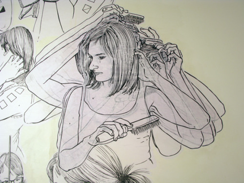
But while that "dinks and boobs" project (which I found kinda cute, actually) might be what some best know Gerard for, the fact is that she has been active on the zine, printmaking and graphic-novel fronts for many years before and since. Recently, she blew up some of her zine characters to life size, using wheatpaste to affix them to the walls of Open Studio's gallery. She's also, over the coming year, using large-scale wheatpaste to create slow-motion animations on a wall outside YYZ gallery.

And across it all, she's still keeping up the yarn-work with her awesome xmas gift idea, "Plants You Can't Kill."

Last month, Gerard took some time to chat with me about her multifacted practice, from crochet to cartoons and beyond. A condensed version is out in today's National Post. An excerpt:

Q: Your new book, Unspent Love, is prefaced by the quote: “People tend to create small towns wherever they are.” Why?

A: That quote’s been important to me for a long time. It’s from Kathleen Norris, one of my favourite writers. Basically, Unspent Love shows the people in my life who form what would be a small town — even though we live in this big city. I like that idea of being located in a place really deeply, and I wanted to put it at the beginning of the book because it was such a guiding principle to what the stories ended up becoming.

Q: So who are these particular people?

A: Well, there’s two stories that feature my sister. One has an older version of myself. Mostly friends, a couple of ex-boyfriends. My son, which is not unimportant.

I wanted to be really specific about using particular people, because it’s related to what the stories are about. But also I liked the idea of these particular people being like avatars for anybody’s experience. I kind of hesitate to use the word “avatar” because the movie and the word is so techie, where this stuff is not technical at all. I just wanted, through the lens of my own experience, to talk about human experience in general.


You can read the rest of the interview and find links to Gerard's comix and animations here.

** ** **

Also, as a bonus, I'm including below something I couldn't find space for in the article: some of Gerard's further thoughts on crochet--something, it should quickly become apparent, that I know nothing about:

Q [You mentioned crochet is very mathematical.] How is crochet about math?

A Oh, it’s so mathematical. It also relates to printmaking. Basically, every point of anxiety and every point of interest that I have in making art is addressed in crochet.

So you’re just doing one thing and you do it repetitively. And you kind of build a three-dimensional or two-dimensional kind of plane based on repetition of the same thing and if you introduce a mistake or a change or a new stitch or you double up, within a few rows or accumulations of pattern it introduces geometry. So it’s like non-Euclidian hyperbolic space. But it’s, like, conceptualized in this material form.

And I’ve used it in the past to understand space or understand problems. Like I had a health problem about a year and a half ago and I crocheted this uterus to kind of start to think about that. I thought my fallopian tubes were like, connected to this ovary but now you're telling me there’s this gap? So I was trying to understand that kind of abdominal cavity so I just crocheted the whole thing and I could suddenly conceptualize exactly where the fault was in my own anatomy.

It’s like, you can model any idea but you can also model any shape. So you can just use it as a process to get at an understanding of how to navigate the world and think about the interiors of things. So it’s mathematical in that way and it’s just like a problem solving kind of process.

Q Cool.

A It’s so… I can nerd out about it forever.

Q You also made recently these "plants that don’t die" out of crochet. Is that because you’ve slayed a lot of plants?

A Yeah. My friend Lauren is this amazing gardener has these huge lighted shelves that are filled with plants, and her house smells amazing. I’m like, so jealous of that. And my mom is an avid gardener. That’s what she does at the end of the day to unwind. She makes this beautiful space that is so cleansing and so great. But I can’t do it! I’ve tried so hard to do it in the past and it is not possible for me to keep plants alive.

So that’s another thing about crochet, it really mediates a lot of anxieties. I feel like it’s very soft and it’s very relatable and often humorous when you use it to make these humorous statements. People are always at my table at craft fairs laughing or talking and it creates a lot of joviality--a lot of really fun conversations.

But for me in everything there’s also essentially anxiety. Like, one craft fair when I had those “Plants You Can’t Kill”—also “Plants You Can’t Kill” has an internal rhyme that is really satisfying—so I had them out and then this woman picked them up and said, “Shouldn’t you call these plants that don’t grow?” and I was like "Um, yeah," and I felt like so blown away, like, “Oh, shit! Everything I do is about failure!” I said, “Yeah, but ‘don’t’ doesn’t’ rhyme with ‘plant”. And she just walked on.

Then for the whole day I was obsessed with that idea, like “Oh my god, they don’t grow, they don’t grow!!! Nothing I do grows!” Ha!

Q Yeah it’s easy to take that stuff to heart, I guess. But that’s really interesting. Sounds like a good practice.

A It’s such a good practice. Some people are like “Oh, I’ve been knitting for years and I can’t crochet.” And others are like, “Oh, don’t you LOVE crochet?” I think people have a relationship to it that’s also anxious, like “I can’t do that! It’s too hard!” or “You're so fast!” It mediates so many human conversations.


I wanted to make sure I posted these stories because (a) I never thought about crochet this way (b) I love anything that helps people talk about anxiety (c) the gap between the ovary and the fallopian tube has always seemed a mystery to me as well and (d) I struggle to keep plants alive too, and can easily see how that could become pathologized by a simple comment. Woot!

(Image from Shannon Gerard's Open Studio installation courtesy of the artist)

Read More......

Friday, December 17, 2010

At the Galleries: Gift Guide Edition


Holiday shopping and gallery hopping needn’t be mutually exclusive. My latest At the Galleries column for the National Post lists three exhibitions are just steps from the mall and have in-house gift ideas handy. (None are commercial galleries either... psych!) Here's an excerpt:

Kai Chan at the Textile Museum of Canada
55 Centre Ave., to May 1
This 1975-to-2010 survey of China-born, Toronto-based artist Kai Chan is astounding — a real must-see. Though he keeps a low profile around town, Chan’s skill, sensitivity and steadiness are internationally top-rate. By precisely grouping simple materials like thread, buttons and toothpicks, Chan creates artworks that are at once elegantly minimal and heartbreakingly human. His rhythmic Mirage, stained-glass-like Link and curvy Marilyn spin major, wall-sized magic out of humble strands, piling, knotting and hanging them laboriously to spectacular effect. And Chan’s feats aren’t just for the eyes; they also offer a gentle, corporeal interactivity. (Just walk up to one of those delicate hangings and you’ll start to see it sway with your breath.) In an accompanying video, Chan, who originally studied biology and interior design, says he wants his art to reflect both the fragility of human bodies and the strength of human will. He has well achieved that solemn goal — incorporating some surprising doses of humour along the way. Need some touching prezzies? Explore the TMC shop for artisan scarves that convey the warmth of handcrafted objects.


You might also think of this column as "A Forum In Which Leah Yet Again Freaks Out About the Kai Chan Exhibition At the Textile Museum." And it occurs to me now, that, in case you didn't know, if you do an article in December, there's an 80% chance it will be (a) a year end list or (b) a gift guide. Not that there's anything wrong with that.

(Detail of Kai Chan's Mirage from the National Post)

Read More......

Friends, Fiends, Fine: Otto Dix Q&A out in today's National Post


You know who came to mind for me when I was trying to think of contemporary artists who continue the tradition of Otto Dix? Ryan Trecartin, mostly because he seems to make even people he loves look kind of horrible. Also, because of the social critique family to which they can both belong. I ask Montreal Museum of Fine Arts curator Anne Grace about these kinds of things in today's National Post, because the MMFA has a massive exhibition of Dix's art on at the moment. Here's an excerpt:

Q Otto Dix’s paintings are stunning, but they can also be kind of horrific, even when depicting people Dix loved. Why?

A We can’t separate Dix from the era in which he lived, and he lived through the atrocities of the First World War [as a German soldier]. So the exhibition, which covers the period from the First World War to the beginning of the Second World War, is completely informed by this experience — it colours everything he sees.

As one critic, Sabine Rewald, put it, Otto Dix and other artists of the era were “injecting bile into their paintings as a way of coming back from the dead.” They had seen such horrors that they couldn’t ever get back the idealism they had going into the war. Everything they saw was through this lens of the extremes of humanity in the 20th century.

Q How does Dix’s work relate to our own day?

A It certainly relates. We opened this exhibition at the end of September, exactly the same time our government was talking about how to compensate soldiers who had been affected by more recent wars. All these questions of war are very much part of our everyday lives.

But Dix isn’t a moralist; he’s not necessarily an anti-war artist. What he does is present us with images of what he lived through, what he experienced. When we present his art today, we’re invited to look at this harsh reality that affected Germans like him but that represents as well the political situation today in Afghanistan and other countries.


You can read the rest (and see more nice pics) over here at the Post.

Because she's a historical curator, Grace declined to name any contemporary artists who might continue the tradition of Dix. Also, I find Dix's work a lot more beautiful than Trecartin's. Still, something about the comparison stuck with me. What do you think?

(Image of Otto Dix's Reclining Woman on Leopard from the National Post)

Read More......

Thursday, December 16, 2010

Reassured by Objects: My Top 3 Year-End Picks at Canadianart.ca


You know what I discovered in putting together my top-3 year-end picks for Canadian Art's website? It's that, the longer I work online (or with other dematerialized realms, like, well, text) the more impressed I am with work that resonates on a physical, corporeal level. Here's an excerpt from my list:

1. Shary Boyle: Flesh and Blood at the Art Gallery of Ontario
Is it just me, or has it been the year of Shary Boyle? There’s this major solo show—which feels like the most space the AGO has given to a single Canadian since its reopening—the Hnatyshyn Award, the big room at the National Gallery’s “It is What It Is,” the sold-out performances, and the mini-showcase of new ceramics at the Gardiner. Throughout, Boyle balances delightful and disturbing like nobody’s business, translating her themes with an increasing commitment to craft that conveys serious gravitas. Remarkably, Boyle even turns the problems of this AGO venue—four historical-collection rooms jammed between two wings of ancient Christian icons—to her advantage by seguing haunting historical works into the first room of her exhibition and juxtaposing her ecofeminist-tinged imagery with a classic Bernini crucifixion scene. As always, it’s an open question as to what the curator, Galerie de l’UQAM’s Louise Déry, contributed in terms of this striking installation solution. But barring a few wobbly points—like Boyle’s relative inexperience in larger-than-life sculpture—this outing showed a major domestic talent at the top of her game. Why can’t the AGO do solo shows of Ontario artists on this scale more often? And maybe even… curate them itself?


The other two are here. And worthy-of-a-read picks from other Canadian Art editorial staff are here. (Stay tuned next week when contributors from across Canada share their favourites.)

All that said, it's pretty much CanArt listmania time, no? This is something I'm happy about, as I inevitably learn about a whole lotta worthy stuff that I missed during the year. So far I've enjoyed the beginning of Sally and LM's open-call seasonal lists (Joe McKay shouted-out the original Tron! Yes!) and the Akimblog cross-country roundup. (That Akimblog link seems tricky right now, but hopefully should speed up soon...) Remember that list submissions are welcome at Sally and LM! Submit! The world needs your list passion!

(Image of Shary Boyle's White Light 2010 from Canadian Art)

Read More......

Tuesday, December 14, 2010

Aesthetic Room for Rent


I just happened to like this little scene on St. Clair West. And it made me wonder yet again: Where is the PhD thesis that explores the line between "esthetics" and "aesthetics"? Or the dozens? There's a lot on beauty here, folks. I'm waiting.

On another note, there's a lot of kind of unexpected stores along western St. Clair. One example: St. John Fish Sandwiches and Antiques. Perhaps worth another thesis outing?

Read More......

Thursday, December 9, 2010

Cool School: Feature on Art School (Dismissed) Now Up at Canadianart.ca


"We don't need no edjumacation!" That's the way I feel a lot of the time if I'm surly. The other lot of the time—well, a lot of a lot of the time—I tend to hold education and all its trappings (classrooms, teachers, notebooks, text, etc.) pretty close to my heart.

Sooooo. My teacher's pet self was excited about the opportunity to explore Art School (Dismissed), a three-day, 52-project exhibition that happened in a long-closed public school this past spring. The result is a cover story for the Winter 2010/11 edition of Canadian Art, which focuses on the theme of artists who teach.

The article looks pretty nice in print given all the snazzy images by photographer Christopher Wahl. But you can also read the full text online at Canadianart.ca in a slightly less snazzy format. An excerpt:

It’s a perfect spring Sunday in Toronto—17 degrees, with sunshine and a mild breeze. Trinity Bellwoods Park, Queen West’s de facto backyard, is full of playground-clambering youngsters, pasty-skinned picnickers and Bugaboo-pushing couples. Clearly, it’s a day for outdoor R and R—a time to forget the salt and slush of winter, and to anticipate the lazier, hazier days of summer to come.

But just a few blocks away, people are lining up to get into—of all things—a school. Granted, it’s a looker: a stately, three-storey, red-brick-and-sandstone behemoth, with expanses of gently rippled vintage glass windows. But it seems faint competition for a little déjeuner sur l’herbe.

Why are so many people—kids and adults—eager to go to school on a day like this? It could be the paper airplanes flying out of a second-storey window, launched by smiling, fold-happy hordes. It could be the eerie tones emanating from a basement bathroom, where a soprano’s song sends light beams twisting. It could be the topsy-turvy classroom where horizontal lines spill from a blackboard, ricocheting in a thousand directions. Or it could be any number of other lovely surprises—a sick-room cupboard lined with primary-coloured crayon drawings, or (on the other end of the sensory spectrum) a small, Gollum-like figure frozen mid-step in a janitorial closet.

The answer is all of the above, but most of all it comes back to the person who has brought these wonders together: a wiry, brown-eyed woman with silver-streaked hair—clad for the moment in headmistress gear—who campily addresses a crowd in the school’s grand, 15-foot-high foyer. She’s the curator and producer of “Art School (Dismissed),” an exhibition of 52 projects that have taken over this long-closed public school for three days—and she’s got a few lessons for exhibition-makers across Canada.


You can read the rest here.

You can also view six extra pics here.

I feel bad about a lot of great stuff that couldn't make it into the article. Hopefully I can post a bit more on that in the weeks to come.

Image of the winter cover of Canadian Art featuring Art School (Dismissed) installations by Monica Tap and Gordon Hicks from Canadianart.ca. Photo: Christopher Wahl

Read More......

Tuesday, December 7, 2010

Wondering: Whither the Toronto Biennial Report?


Lately, I've been wondering what happened to the Toronto biennial report that was due to be released months ago by the MOCCA and the Power Plant.

The report was due to be released on the heels of the biennial-themed symposium that MOCCA and the Power Plant sponsored way back on April 17. In a MOCCA press release dated April 27, these same institutions promised to make the report—a summary of the day penned in large part by critic/panel moderator Peggy Gale—available by the end of May.

Yet there's no sign of the report six months later. Nor any sign of the video footage of the daylong event that they had also promised to put online. At least (isn't this always the caveat with Unedit My Heart?) as far as I can tell.

I have inquired repeatedly with the press people at these institutions, who have politely said "we'll tell you when the report is available" and I asked Gale herself in October, when she told me she had filed her part of the report some time ago.

I have also asked the institutions' press folk what the status is of a potential Toronto biennial event. Many I've spoken with in the wider art community believe the biennial to now be a "done deal," with the "community panel" in April, as well as any promises of further dialogue or reports, simply window dressing. But the institutions, as far as I can tell, are still mega-mum on this point.

The result is a bit of a disappointment for those who want to have some faith in our publicly funded art institutions. I know planning takes time, and institutions have their reasons for embargoing upcoming show information. And I have enjoyed a lot of the shows at these institutions, and respect a lot of the curatorial work that happens there.

But when you promise to make a summary report—basically meeting minutes—available online after a day where the community has come out in good faith, it's really nice to see that followed through. Same goes for the video footage. This isn't rocket science. And the longer these institutions delay posting the report, the harder it is to tell whether the cause is incompetence, subterfuge, disregard/contempt for audiences or some combination of all of the above.

So--Murphy's Law being what it is--I have a sneaking suspicion that I will publish this post and then immediately will receive a press release to the effect that the report is now online. A collary to this is that tomorrow I will look through the paper and someone will have published a big scoop on "Toronto biennial 2011." But this roadblock to information has persisted for so long, hey, I'm willing to play the fool to point it out.

If you are wondering what happened at the panel in the first place, feel free to consult my (noncomprehensive) take from earlier in the year as well as that of Richard Rhodes.

For some opinionated background on the much-tortured issue of whether a Toronto biennial is in order, also check out Murray Whyte's piece on the subject from last year.

Also of interest: Terence Dick reflects the views of many when he writes that the biennial is a foregone conclusion.

Anyone with questions, insides or psychic hunches on the matter, feel free to comment.

Image from Ragtimepiano.ca

Read More......

Thursday, December 2, 2010

More Poe than Po-Mo? David Hoffos @ MOCCA, Bill Burns @ MKG127, T. Lansdowne @ Le


Frequent readers will likely have picked up on my affection for alliteration. (See! There it is again!) In my latest set of reviews for the National Post, I unleash this addiction again, for good or for ill, on David Hoffos' show at MOCCA (as well as, to a more limited extent, Bill Burns @ MKG127 and Tristram Lansdowne @ Le). Here's an excerpt:

David Hoffos at the Museum of Contemporary Canadian Art
952 Queen St. W., to Dec. 31

For the past few weeks, David Hoffos’ Scenes from the House Dream has been generating lineups at MOCCA. And for good reason — Hoffos, who’s toiled in Lethbridge, Alta., for the past 20 years, has an output that’s distinctive in both its sense and its sensibility. His material technique precisely arranges analogue TVs, picture frames, mirrors and dioramas to create a unique, physically immersive virtual reality. And his moods are steadfastly eerie, with a touch that’s more Poe than po-mo. The result at MOCCA is several small, magical scenes: a man throwing rocks off a cliff at night; a strange light landing at a town’s edge; a ghostly trailer-side apparition and more. Shadowy life-sized figures lurk in the dark as well. Though frightful at times, it’s all good — one of the most compelling tensions in Hoffos’ work is the way his melancholy, noir content contrasts with his seeming delight at its elaborate staging. Interestingly, the exhibition itself also has a chimerical, now-you-see-it quality — though Hoffos has shown extensively to acclaim in other parts of Canada for years, this is pretty much the first time Hogtowners have gotten a good look at him. Lesson learned: The “hinterland” has an artistic who’s who, too.


Read on here at the Posted Toronto blog for the other reviews. (The story will also be in print on Saturday if you prefer it that way.)

(Image from David Hoffos' Scenes from the House Dream, Winter Kitchen via Posted Toronto)

Read More......

Wednesday, December 1, 2010

UPDATED Of First Nations and Fubar: Q&A with Terrance Houle out in Today's National Post


Fubar humour meets First Nations history in the wry artworks of Calgary's Terrance Houle. His unique approach is earning the Blackfoot/Ojibwa artist increasing notice, with shows now on at New York's National Museum of the American Indian and Toronto's Art Gallery of York University. (Seriously, he's a busy guy! Also showed at SAW Gallery's Art Star video fest this fall and performed at Gallery 101.) So I was thankful Houle took time to chat with me about a few aspects of his work recently. The resulting Q&A, condensed for space, was published in today's National Post. Here's an excerpt:

Q It seems like you're everywhere this fall. How are you dealing with your increasing success?

A The biggest thing I get out of it is meeting people and finding out the impact that the work has on them. That's the reason I got into this, to advocate for First Nations people in my own way. Also, I grew up an army brat and powwow dancer, so it's like getting back to my old days of travelling all over the place and performing.

Q What do you most want to advocate for in terms of First Nations?

A Our position within North America, especially in the West, where I live. In Calgary, our presence as aboriginals is sort of there but sort of not. It's in the roadways: There's Deerfoot Highway and Crowchild Trail. But does anybody really know who Deerfoot is? That he was the runner who ran between forts and was a messenger? And the answer is no, a lot of people don't know that. I find that really odd.

Q How do you deal with diversity within the First Nations community? Some of your art plays on related tensions, like urban vs. rural or traditional vs. contemporary.

A Yeah, that's something drawn from my own experience. I grew up being called an "apple" whenever I went to my reserve, which is like, you're white on the inside and red on the outside. It's a derogatory term trying to say, "Well, are you native enough?"


And y'know, this didn't make it into the interview, but I'm serious about the Fubar connection. Not only does Houle have a lot of humour in his work (something we discuss later in the interview) but the name for his current touring show, GIVN'R, came about when he was hanging out with Dave Lawrence, who plays Terry in the movie. Houle says that while the term had joke qualities, it also "kind of fit my career. It’s just the [distillation] of the last 4 to 6 years: working hard and partying hard. And we’re prairie boys and grew up always saying it." Houle has also helped Lawrence out--specifically with representations of native people in Lawrence's upcoming film A Legend of Whitey. Like, small world, eh?

If you're in the GTA want to see Houle's work in person, get thee to the AGYU, where Houle's GIVN'R closes on December 5. And if you want a look anywhere, it's worth checking out the NMAI's online exhibition for HIDE, which features Houle's work.

**UPDATE** Soon after I posted a link to this Q&A on Twitter, artist Duane Linklater (@duanelinklater) raised a valid criticism that I thought was worth sharing here:

"Going off the reserve" its really called that? nice interview but really? RT @leahsandals My Q&A... National Post - http://bit.ly/fTY9Od

This was my response:

@duanelinklater Totally fair critique, Duane. Unfortunately, I don't get to write those headlines. Usu. Editors of publications pen those.

then:

@duanelinklater I hope it's clear in my last tweet that I think *your* critique is valid, not any critique implied by the headline!

then:

@duanelinklater If you have any other thoughts or concerns, pls let me know. Letter to the editor is another good option for lots of readers

Obviously I need to be a little more concise in my responses! Anyway, it's all to say that I appreciate Duane's concern. If anyone has other worries, critiques or comments, please feel free to let me know via twitter, blog comment, email or otherwise. I also mentioned letters to the editor (as I have in the past around reader concerns for any publication) because it's a way to let those in charge know directly how you are feeling about their publication.

(Image from Houle's Urban Indian series from Musée d'art de Joliette)

Read More......

Tuesday, November 30, 2010

Fuse Magazine reaches $10,000 goal for December 1 -- $30,000 Left to Go


Congrats to arts-and-politics mag Fuse on reaching its goal of raising $10,000 by December 1. The funds are to be used to make up for federal government cuts to small-circulation magazines. (Small-circulation is defined as a circulation of less than 5,000.)

The December 1 goal is just part of the effort at Fuse, though; the magazine hopes to raise $40,000 in total by March in order to cover the cuts. Donations of all denominations are being accepted, and you can donate here if you'd like.

One of the interesting things to come out of this funding drive is the notion that Fuse is using it to re-evaluate its approach. The magazine is now putting more content on its website and becoming more engaged in social media. From their post "We're in this together":

Fuse is a work in progress! This moment has provided an opportunity for us to rethink what the magazine has been doing, increase community engagement and consider the different forms our editorial content can take. By consulting with you, we are bringing more people into the organization to help rethink, re-imagine and re-create what Fuse is and can be.
...
We are part of an industry that is changing, and we are excited to explore the ways that Fuse, too, is changing: to reach more people, and to engage in a more meaningful and long term way with diverse communities. Our intention is to intensify the amount of free online content that we provide while maintaining a print presence.

To help us steer the organization into the future, we have mobilized a steering committee for the organization. Franco Boni, Deirdre Logue, Rebecca McGowan, Christopher Regimbal, Kristian Clarke, Jessica Shepherd, June Pak, Syrus Marcus Ware, Izida Zorde, Denise Macharacek, Michelle Jacques and Srimoyee Mitra are working to put these ideas in motion and make Fuse magazine relevant, readable and revolutionary. And this list of people is growing.


I, for one, feel for the many small magazines whose federal funding has been cut by these measures. As has been pointed out elsewhere since the cuts were announced almost two years ago, many of these smaller magazines have helped nurture writers that went on to greater fame in the market and elsewhere. Also, this same requirement around circulation is, interestingly, not made of book publishers as far as I know. In Canadian book publishing, it's rare to sell more than 2,500 to 5,000 copies of a given title.

I also think that Fuse in particular offers an outlet for points of view not typically expressed in the "mainstream" art press. So I'm excited to see their success with this first fundraising goal, as well as a renewed push to reach out online. If you're interested in finding out more, I recommend reading Art Gallery of Ontario curator Michelle Jacques' letter of support.

(Image of a past issue of Fuse from Praxis Theatre Blog)

Read More......

Monday, November 29, 2010

Driving Art Up the Wall: Jeff Harrison, Cavalcade, Shannon Gerard


This past week, I've gone to a few fun shows that have artists working intensively with walls. All three are recommended for a drop by. For his exhibition at Parts Gallery, pictured above, Jeff Harrison takes his characteristically crazy-busy canvas style and extends it onto screenprints on newsprint, which paper the walls. Extra prints were handed out for free at the opening, and Parts tells me they still have a few on hand if you'd like. My favourite work in the show was was a work that spelled out "GRAVY," a word which seemed to sum up, for me, the enjoyable excess that characterizes Harrison's best work.


Over in the west end, there's a also Cavalcade, a terrific show by a group of young illustrators at Xpace. For this show, the illustrators have painted and collaged directly onto the gallery walls, often using the theme of the parade or procession. Apparently over the course of the show they're also adding details to each others' works. Very fun. Also reminds me, considering a different angle of the show, of the success that Team Macho has had mining the illustration/art divide. (Team Macho's show, which recently closed at Narwhal, was very fun as well. How, I wondered as I looked at their painting of a Batman/Spock/Han Solo hybrid, has this collective managed to so effectively plumb the depth of my husband's sci-fi-centric brain? Remarkable.) (Image of Cavalcade in progress from illustrator Nat Janin's website)

Finally, Shannon Gerard, fairly well known for her bookworks in Toronto and recent winner of This Magazine's literary competition, graphic novel category, has begun a wheatpaste wallwork near YYZ that will evolve slowly over the course of a year. Though the wheatpaste graphics are based on her recent bookwork Unspent Love, Gerard plans to add a twist in the wallwork of wheatpasting in changes twice a month to create short stop-motion animations. This way, over the course of the year, several narratives will slowly unfold on the wall. You can watch a GIF of her first animation here. (Detail of Shannon Gerard's wheatpaste installation from her Unspent Love tumblr)

Read More......

Friday, November 26, 2010

Congrats, Critiques and Conundrums (w/ Conflicts!): It Is What It Is


Time for another conflict-of-interest-filled blog post! This time, I’m taking on “It Is What It Is,” the National Gallery’s current exhibition of contemporary Canadian art, which is pulled from recent acquisitions but is framed partly as a biennial (a format which, in the art world, is usually understood as not being based in a museum’s holdings nor including works older than two years old).

To be clear, the conflict in this instance comes about because I was invited to moderate a panel at a symposium related to the exhibition, Conversations about Contemporary Canadian Art, which took place last Friday, November 19.

In advance of the exhibition, I rounded up available reviews, most of which were fairly positive. Yesterday at Canadian Art, I also helped edit my colleague Bryne McLaughlin’s take on the show and proceedings. Oh, and in terms of other recent coverage, Robert Labossiere of the Canadian Art Museum Directors’ Organization took some rough notes during the panel and another that preceded it, which can be viewed here and here.

So that’s what everyone else is sayin’ and my two cents is really not needed. But damn the strictures of necessity! To this, I add my extra-biased, extra-long-winded rundown, divided into Congrats, Critiques and Conundrums. (I warn you, reader, this is on the very "un" side of "unedited" and leaves out a lot of complexities raised during the symposium, so feel free to add your views, conflicting and otherwise, in the comments.)

Congrats
  • It Is What It Is is actually a really great, enjoyable show overall. There. I enjoyed it. And I said it. It meets the "would recommend it to a friend" test.
  • Part of the enjoyment is that I really did feel it’s a fairly accurate reflection of the contemporary Canadian art scene – even if it’s not totally completist, most of the key names are here. You feel like someone who isn’t that familiar with the art scene could use this as a good starter primer.
  • There’s also a nice mix of expected and unexpected names – Simon Hugues, Rodney La Tourelle, Susan Turcot were less expected, for example, while David Altmejd, Shary Boyle more on the expected end. It’s not just a “usual suspects” show.
  • Of course, part of the enjoyment is also that there’s some pretty great individual works in the show—the Rodney Latourelle, a set of large coloured structures that one walks through, is delightful, as is Luanne Martineau’s massive, floppy, felted Parasite Buttress. Sarah Anne Johnson’s Galapagos Project, Simon Hughes' pencil drawing, David Altmejd’s Two Holes, Benny Nemerofsky Ramsay’s Live to Tell, Rodney Graham’s the Talented Amateur—basically a good load of engaging, solid works to be seen here.
  • It’s also a sizable show – though could be bigger, it’s big enough to not feel cursory or duty bound as a project, at least to the viewer (there were some wonderings from folks I spoke with about how into this project the curators were, given that it was likely director Marc Mayer’s brainchild, but the results remain engaging enough nonetheless). (Part of my noticing this size-of-the-show aspect relates back to the strange kind of space crunch that Toronto often lands in; though many TO institutions have expanded their galleries of late, few have the kind of square footage that the National Gallery can offer.)
  • The overall result is that I felt warmly, and actually a bit mini-patriotic about this show. I felt glad it happened, and overall was impressed. It felt like the kind of thing a National Gallery should be doing.
  • Also, the catalogue is a nice, pragmatic accompaniment. It’s a handy guide to some of the major contemporary art players at the moment. Probably not academic enough for some, but I like a good guidebook. I can see myself referring to it in future, like I do the catalogue for another Mayer project, the Quebec Triennial (though the Triennial catalogue was more useful in that it had some CV information for each artist in the back)
  • Similarly, I appreciated that texts were provided in the gallery for almost every work. I get very annoyed by public-institution shows that assume the viewer already knows about an artist’s practice, or where a particular work has come from. I like shows that feel at least partway friendly to the public in terms of wall texts. So this fit the bill that way for me. And for the text-haters--don't worry, the texts were there, but unobtrusive.
  • There were some interesting themes traced throughout the show, none of which are endemic to Canadian art in particular, but that made for some enjoyable conceptual weaving—like the first room focusing on art history and ideas about art, the next two rooms seemingly about different approaches to sculpture, the next two after htat somewhat about multipanel narratives and idealized landscapes, another room later on referencing décor and the politicization of space, and another room later on taking up ye olde photography/death dualities. Overall, a lot to grab onto conceptually and thematically (thinking about drawing, which was prominently featured throughout, for instance) as one worked one’s way through the exhibition.

Critiques
  • As was pointed out repeatedly at the related panels, it’s dubious whether a recent-acquisitions show can actually a biennial make. I’m not an expert in this field, so I can’t really say. Walking around at points I would think “Well, this is the best in Canadian art, really,” but then I would catch myself and remember “Well, the best that the National Gallery can afford.” There can be a difference, right? At the same time, I do appreciate the pragmatism of showcasing works that you’ve already spent money on—heck, if you’re willing to spend money on it, you must think it’s pretty good, right? Short version: Though the show was enjoyable, the labeling of it was problematic to some. As long as it’s a good show, I don’t know if it needs to be called a “biennial,” though the copy editor in me notes that as long as it’s a biannual event, that term might still technically fit.
  • As a collary to the above, it could be argued that while there's a lot of strong artists in the show, not all are represented by their strongest works. I heard someone whispering this particularly around the Isabelle Hayeur, but it could also apply to the Adad Hannah, the Jeff Wall (though at least that was surprising in its gelatin-silverness and lack of figures and newness), the Tim Lee, etc.
  • While the print catalogue was satisfying, I was disappointed not to see more of its information distributed online. The National Gallery put a lot of web resources into promoting an imported show, Pop Life, this summer. There were podcasts, artist bios, primers, etc. for that one. The site for It Is What It Is is a bit impoverished by comparison (not podcasts, no primers no bios) which is a shame, because our country is so big and it’s not like all Canadians will be able to visit the show. Only a very small percentage will be able to do that. Plus, I know there can be a fear institutionally of putting work online (if people can get the milk for free, etc.) but I really think putting more of it online would draw more people from the region into the gallery to see the show. The work is strong enough to provide this tempting effect.
  • As a minor complaint, there were what seemed to be a few installation glitches; for example, six or seven works were relegated to quite small video monitors near the exit of the exhibition, and were easily missed as a result. For a few days last week, the Valerie Blass sculpture, a centerpiece of the exhibition, went AWOL due to damage, with no accompanying signage to indicate same. And (this is a small complaint, because it’s not something I immediately noticed), Geoffrey Farmer was promised as part of the show in the catalogue but in the end did not end up in the exhibition. When I asked about this, I was told by the gallery that during the installation process they realized there just wasn’t the space to showcase his work. (So there’s a case for the idea that even though the exhibition is large, it could be larger.)

Conundrums (many being borrowed questions that many others have iterated--if attribution is missing or incorrect, please let me know and I will fix!)
  • Why did it take 20 years time between the National Gallery’s first biennial of contemporary Canadian art in 1989 and its second, this year? As Ken Lum pointed out during his appearance at a related panel, that’s a pretty crazy amount of time to wait, no? I can’t recall who clarified (it was probably Lum as well) that part of the problem after 1989 was that it had been assumed that regional venues would organize subsequent national biennials, and that just didn’t happen. Anyway, the result is kind of bittersweet—like, “Yay! Awesome way to revive something we really need!” on the one hand and “Why did it take so damn long?” on the other.
  • How much is an exhibition like this tied up in notions of Canadian identity? And how do those ideas relate to power dynamics in our society? Part of the panels for the exhibition turned into what I might consider a classic CBC phone-in on this first question of “Canadian identity—what is it?" and extending it to "Can it ever be summarized in an exhibition? Is it too diverse and flexible to be named? Etc.” But part of the critique was also well warranted, as First Nations curator Ryan Rice pointed out that many of the First Nations artists he has worked with do not identify primarily as Canadian, or may (quite reasonably, given the circumstances of residential schooling histories, forced migration, etc.) even see Canada as an aggressor and not wish to be identified with it. Personally, I hadn’t considered these aspects of the show in much depth; I had considered Canadian art to maybe be “art made by someone with a Canadian passport or residing in Canada”—but I can see it’s an important question.
  • Why is it always (or perhaps at least more often than one would like that it is) seemingly left to non-Canadians to do key documentation of (or key recognition of) Canadian culture? This question came up for me via a number of factors: that Ken Lum opined there is still no comprehensive history of contemporary Canadian art, saying the last useful book in this vein, Dennis Reid’s A Concise History of Canadian Painting, was published in 1980; that some curators in conversation then noted that a book like this is being released soon, but by a British publisher; that I remembered the book Art Textiles of the World: Canada was also recently published by a British house, Telos; and that I also read on the way back home via Leah MacLaren about a modern Canadian poetry book being also published by a British house. On top of all that, one of the panelists at the conference was Denise Markonish, an American curator who is actually organizing a survey of contemporary Canadian art for MASS MoCA, to open in spring of 2012 with an MIT-published catalogue. Crazy! Obviously this question is somewhat redundant—by doing “It Is What It Is” the National Gallery is making a gesture towards picking up the slack on documentation and recognition of the national scene—but it was a pattern that really struck me.
  • Why has the nonexistent book Ken Lum mentioned not been created yet? Is it because art history works best with the far past rather than the near past? Is it because art history requires secondary sources into order for research to be considered “serious” by one of its many academics? Is it because it would be too politically risky for any institution to take on such a project? Or is it the classic “no resources available” for such a long-term, wide-aiming, travel-require project? Is the answer all of the above?
  • How can we get more Canadian art institutions working with decent online formats? And distributing information about art in ways that Canadians can actually access and use? It was clear to me during the panels that curators are very comfortable discussing physical exhibition formats and physical documentation and research (ie. catalogues). But they clam up when asked about how to better distribute that information (both visual and text) online. And you know what? To a large extent I get this. We see this every day even in the media industry, where print publications are given way more eyeballing and way more financial and human resources than their related web counterparts. But! But! The fact is that it seems kind of crazy to sweat every comma and colour balance on an exhibition catalogue that will likely sell just 5-20% of its print run, and that to a limited audience, while the website for that show or institution, online 24/7 to a potential audience of thousands, is barely updated, or even, in some cases, nonexistent. (!!!) People, you don’t have to sell me—a word nerd and an art nerd—on the importance of print. I like a beautiful book object as much as the next library luster. But! But! But! I also use this thing called Google to find information these days, y’know? Just like you probably do. So… if you really want to share information about art you’re showing, Canadian and otherwise, you need to start making some beautiful websites too. Or at least some functional and informative ones. I know there can be copyright issues involved, but please, let’s get working on this! The word nerds and art nerds need to meet up with some tech nerds, alright? And stop pretending there is just one or two kinds of nerdom that are valuable. Nerd convergence. Nerdvergence. Let’s use it for the greater educational good. (Sorry to seemingly go off the deep end on this one, but these concerns were further exacerbated by reading Amy Fung's Akimblog report on a recent curators' conference in Banff where some outright *refused* to write for online. What?????)
  • Further to the above question, what websites are actually useful for helping high-school teachers (or anyone else) teach Canadian art and learn about Canadian art history? And, by extension, helping non-traditional art audiences learn about art? According to one audience member who stepped up to the mic, the answer is “nil.” The National Gallery representative told her Cybermuse (the gallery’s web-archive project, which I’m told has been updated more recently) was a good bet, and I filled her in on Canadian Art’s soon to be launched canadianartschool.ca. But this is a very valid question. We have no Art 21 equivalent here. And even if we did… or if we do in future… is it being marketed well enough to actually connect with the people who need it? Can that connection be made? I hope so. This teacher’s question really seemed to signify for me the disconnect between art-worlders and interested “non-art-worlders” (ie. people without an art degree or positions in art institutions) – the latter might actually be quite interested in art, but as they can’t find anything about it online, they are left with the impression that it is not all that interested in them. At the same time, because the institutions are not putting (we might qualify this with sufficient or appropriate) resources into web and marketing and being friendly and open, they are left with the feeling that the wider public actually doesn’t like them very much. I urge the institutions to make the first move on this front—reach out to people as much as possible. Be friendly. Be easy to find. Make information about art available online, so people can be drawn into its narratives and wonder from their living rooms, and yearn to seek it out in person. Well, to be honest, I don’t know how accurate my interpretations and connections are on this. All I know is there is a disconnect between art institutions and their non-traditional publics, and it would do well for the art institutions to reach out a bit and try to bridge some of those gaps.
  • And finally.... how on earth will the National Gallery be able to pull together something similar over the next couple of years? What will the next "biennial" of this sort (should it, please God, actually happen to actually fulfill the term) look like? Do the curators feel like they actually have time to pull it together in addition to all the other stuff they have to do? Will the acquisitions style (or acquisitions pressures) change if it's understood that this exhibition is an ongoing affair? Is doing a first biennial like doing a first amazing pop or rock album, the kind of thing that actually takes the accumulated experience 20 years (or even 10) to do rather than just two? Anyway, as is probably already clear, I do hope another exhibition of this type does get organized by the gallery for 2012. It was impressive to see how much material the gallery has acquired over the past few years, and what good quality most of it seems to be. So I wish the gallery best of luck on the next go-round with the caveat to please consider pumping some more web-info-distribution into the mix.
There's a lot of other issues to be discussed about this show, many of which were raised in the symposium. I hope everyone and anyone feels free to post comments about their views, critiques, congrats and questions below.

(Image of the "you're running out of time" notes I passed to panel speakers in Ottawa from yours truly.)

Read More......

Snowed Under: Personal Essay out in December's Canadian Geographic


Recently, in presentations to school groups, I've proposed that the subjects in which I have the most expertise all fall into the category of "ways of mapping the world" or "ways of recording experiences in the world"—namely, geography (which my first degree was in), art (which my second degree was in) and writing (where I've actually managed to make a bit of a career addressing matters related to those first two topics).

So it's with some pride that I see one of my pieces of writing printed in the December 2010 issue of Canadian Geographic. It's a personal essay published on the back page's "In Habitat" section, and it describes a visit to my hometown of Calgary, as well as some of the hidden and not-so-hidden emotional landmarks that exist for me there. Here's an excerpt:

It was a blue-sky Alberta foothills day, with the kind of clear, intense light that makes a Toronto-dwelling ex-Cowtowner smart at all the grotty slush and brown, smoggy afternoons she’s unjustly endured.

A thick, two-foot-deep frosting of glittering snow layered the landscape, refracting the sun in a million directions. My eyes squinted at the dazzle as we reached the edge of a small valley where bare, winter-elegant aspens stood.

With the outline of the Rockies in the distance, it was a perfect day for any number of outdoor activities—for skiing, for sliding, or even for that most gentle of Gore-Tex clad, polarized-sunglass-shielded pursuits: strolling leisurely, coffee in hand.

But it wasn’t that kind of day for me, nor for my fiancé, sister, brother-in-law and nephew. Despite the postcard-worthy loveliness of this place, we’d come on a less pretty endeavour—to find, and then visit, the dead.


Cheery, no? It gets better from that point on, I swear. And, to reiterate, I do feel honoured to be in the publication, which has done a super job over the past few years providing indepth coverage of climate change issues and other overlooked topics. (This December issue, for example, also contains an extensive feature by Linda Goyette on the need for schools in a Cree community on James Bay.)

Anyway, the rest of my essay isn't online, so I urge you to pick up a copy of Canadian Geographic at your favourite newsstand!

(Image of a snowy Calgary park from the City of Calgary)

Read More......

Saturday, November 20, 2010

Out today: Reviews of Shows around Queen's Park


Today in the National Post, I review some of the shows happening in the Queen's Park area - all of which are among the strongest of the year. Here's an excerpt:

Breaking Boundaries at the Gardiner Museum
111 Queen’s Park Circ., to Jan. 30
This striking exhibition highlights four youngish Canucks who use ceramics to address manga, mayhem, monsters and other Nickelodeon-friendly themes. As a result, the show seems specially designed to attract “kids” — both toddlers or twentysomethings. But in reality, Breaking Boundaries is a terrific exhibition for all ages and stages: Its pop themes tempt the masses while its new works impress art stalwarts. B.C.’s Brendan Tang, known for mashing up sci-fi gadgetry and Ming-period vases, appears in video as an Indiana Jones-style swashbuckler. Ontario’s Shary Boyle surprises with ceramics that are bigger and rawer than ever before; these don’t just tolerate cracks, but highlight them in gold. Saskatchewan’s Marc Courtemanche offers a massive installation that looks like a woodshop but is largely crafted out of clay; it combines blue-collar workbenches and highfalutin’ art studios to pleasing effect. Finally, Quebec’s Carmela Laganse contributes fantastical vampire furnishings — regally upholstered objects that’d be right at home in True Blood’s vampire-king-of-Mississippi mansion. Check the show’s comment book, too; it traces viewer debates and demonstrates that when museums set out to engage “kids,” they might just engage the kid at heart in all of us.


I'm serious about the comment book--it's confusingly labelled "Be a Curator" and is somewhat edited by staff, but really it is Best Comment Book of the Year. The first Shary Boyle-related comment, printed in shaky pencil script from "ANONYMOUS" listing their age as "OLD" and occupation as "--" is along the lines of "I love Shary Boyle's porcelain lace but I can't stand her mutilated women. What's wrong with her?" (I'm away from my notes right now, hence the paraphrasing.) The responses that follow that comment continue to show the diverse ways individuals can react to artwork.

In the rest of the column, I also review shows at the University of Toronto and the ROM. You can read on here. (Regarding the last review, I can see I've been hard on our big instos lately with placement issues--also did it with an AGO review a couple weeks back--and I do wonder, what's up with that? Why are placement issues bothering me so much of late? I guess I blame (a) my persnickityness and (b) my geographical training. For now. And maybe what seems like Toronto's perpetual space crunch.)

(Image of Marc Courtemanche's The Studio--an example of his work that is largely crafted out of clay but, interestingly, shaped using woodworking techniques--via the National Post)

Read More......

Friday, November 19, 2010

Of Place and Politics: Robert Adams Article out in Today's National Post


A few weeks ago, I scrambled across town on the streetcar to pick up a copy of Robert Adams' What Can We Believe Where? from what is perhaps the only bricks-and-mortar bookstore left in Toronto that's arty enough to stock it. (That store was the always-worth-a-visit Type Books, by the way.)

There was a bit of irony to this endeavour, I guess, (or at least Alanis Morissette might say so) because Adams, who was an english lit professor before he was a photographer, tended to focus throughout his career on distributing his art through books. Sure, he ended up showing in big galleries too, but he believed books were the best way to get his images and sequenced narratives out there.

In a way, this bookish principle remained true for me this time out as well; Adams' career retrospective, organized by Yale University Art Gallery, is currently on at the Vancouver Art Gallery, thousands of miles from where I live; so this relatively affordable paperback ($26), which contains about a third of the pictures from the show, was really my best entry point. Given, er, that I was able to track it down what seemed to be the only copy available for retail sale in Toronto. (It is also available from the major online booksellers, but I didn't have time to wait for shipping.)

Today in the National Post, I ponder What Can We Believe Where? and what it means for audiences today in terms of both form and content. Along the way, I got to speak with Yale University Art Gallery director Jock Reynolds and think about how Adams' ideas on place connected with my reaction to recent elections across North America. An excerpt:

Recent municipal elections across Canada, like this month's U.S. mid-terms, have highlighted the connection between place and politics. These outings show that North America's continental divide isn't just one line on a map; boundaries of east vs. west, north vs. south, urban vs. rural and suburban vs. downtown are also often marked at the ballot box.

Oregon photographer Robert Adams is well familiar with this intertwining of geography and judiciousness. His new book What Can We Believe Where? (an accompaniment to a new touring retrospective, The Place We Live, currently on at the Vancouver Art Gallery) concisely spans 40 years of his photographs of the American West. In its introduction, the 73-year-old Adams reiterates the questions that have intrigued him throughout his career: "What does our geography compel us to believe? What does it allow us to believe? And what obligations, if any, follow from our beliefs?"

Leafing through this compact paperback, it's clear that Adams' take is a complex balance of horror and hope. The book's 109 images, chosen from 2,000 of Adams' best prints, often focus on what some call environmental disasters -- the massive 1970s expansion of Denver-area tract housing, the 1980s growth of the Los Angeles smog bowl, and this decade's Coos County clear-cuts. But these sobering sequences (expanded to comprise 300 prints in the retrospective exhibition) are also woven with gentler scenes: a warm-hearted farmland coffee klatsch, a beautiful grove of prairie poplars, a gleeful toddler greeting her family.


One thing that I was glad to hear from Reynolds was that Yale co-curator Joshua Chang did manage to convince Adams, and his partner/collaborator Kiersten, that it would be a good idea to try and distribute his photos from the show through some 21st-century means--namely, a website--as well as through these nicely produced books. I do urge ya'll to check out the resulting survey exhibition site at http://artgallery.yale.edu/adams/.

If Robert Adams was a young photographer today, I wonder if he'd be a steadfast Flickr or Tumblr user, twigged to these non-gallery, populist means of distributing photography. We'll never know, but I'm glad that his exhibition has been put online and in print form for those of us who can't make it to the show. And for those who can make it to Vancouver, the show will be up until January 16, after which it travels to Los Angeles, New Haven, Madrid and other sites.

To read more about the new book and Adams' work, visit the National Post.

(Image of Robert Adams' Edge of San Timoteo Canyon, looking toward Los Angeles, Redlands, California 1978 Courtesy Yale University Art Gallery and via Canadian Art)

Read More......

Tuesday, November 16, 2010

Que Sera, Sera: It Is What It Is Preview


In advance of my moderation of a panel on "Canadian Art: Exhibiting and Disseminating" at the National Gallery on Friday, I've been trying to seek out reviews of the exhibition that has spurred the panel--It Is What It Is, which displays a selection of contemporary Canadian art acquired by the gallery over the past two years.

Here's what I've been able to dig up:

Andrew Wright's thumbs-up at Akimbo

Peter Simpson's exhibition highlights in the Ottawa Citizen, with more pics available on his blog

Notes on the exhibition's lessons for Parliament Hill from the blog of Toronto Star politics reporter Susan Delacourt

Maclean's capital-region reporter John Geddes' blog post on It Is What It Is, which to his mind is better than Pop Life

A slideshow at CBC.ca

And, more tangentially, the Telegraph Journal notes there's no New Brunswick artists in the show during an extended interview with gallery director Marc Mayer

Anyway, I do look forward to seeing the show myself—in that, y'know, conflict-of-interest-filled way. To recap, the panel I'm involved with features Barbara Fischer (Barnicke Gallery), Louise Dery (Galerie de l'UQAM), Scott McLeod (Prefix) and Reid Shier (Presentation House Gallery) and is prefaced by a morning panel on Canadian Artistic Practices at Home and Abroad. That morning panel features Adam Budak (Kunsthaus Graz), Josee Drouin-Brisebois (National Gallery), Ken Lum (Independent), Denise Markonish (MASS MoCA) and Ryan Rice (Museum of Contemporary Native Arts). Registration info for webcast and in-person can be found here.

(Image of Rodney Graham's The Gifted Amateur Nov. 10th, 1962, 2007 © the National Gallery of Canada)

Read More......

Monday, November 15, 2010

Admission Impossible: Museum Fees Chart now out in This Magazine


Last month, at the When Critics Speak panel for Nuit Blanche, I got on a bit of a jag, as I so often do, about economic barriers to gallery and museum access in Canada.

But I also appreciated the response of audience member Kim Simon, well-respected curator at Gallery TPW, who shouted out that many of the major museums and galleries are hard up for cash, which is why they have to charge what I consider to be such high admission fees.

In discussing the matter with Kim, I came to the conclusion that both things may be true, that:
(a) Many major public galleries and museums in Canada have implemented significant (sometimes internationally unusual) economic barriers to public access in the form of high admission fees and eliminated free hours
AND
(b) Many major public galleries and museums in Canada genuinely feel strapped for cash

I haven't any solutions to this conundrum, but to me the fact remains that it is in the mandate of many public galleries and museums to provide public access to their permanent (ie. public-owned) collections, and that they need to figure out how to restore levels of access to international norms—no matter how strapped they may be feeling.

In continuation of the discussion on this theme, I have a small charticle out in the current November/December issue of This Magazine. It's called "Admission Impossible" and lists data to the effect that Canada's museums are among the most expensive, least accessible in the world.

Since writing the piece, I've become more aware of some more nuanced barriers to public access in cultural institutions--things like daytime-centric hours of operation and codes of behaviour--that are explored at length by more expert sources like Nina K. Simon and Simon Brault.

However, I do believe economic access is still at a substandard level in Canada's major museums and galleries, a fact that is particularly surprising given admission fees only tend to make up a small (5-15%) portion of museum revenues.

What other things do you think are true about museum management in Canada? Both for good and for bad? Feel free to post. Also feel free to read the rest of the This article here.

(Image from This Magazine)

Read More......

Wednesday, November 10, 2010

Finally Getting It: The Cedar Tavern Singers


I've heard a little bit about Alberta's Cedar Tavern Singers in the last few years, seen their name pop up in group shows and reviews and such. So it's a testament only to my own lack of effort that it's taken me this long to actually twig to the awesomeness of some of their stuff--namely, songs and (more recently) dance numbers about art and art history.

What finally got me listening, and what I highly recommend, is actually a video I can't embed--CTS' jazz-handed tribute to the Mendel Art Gallery in Saskatoon. Please view it on their webpage. It's really very cute and sweet, and extra, extra, extra (!) Canadian. Like, can we have some Canadian Heritage Minutes like this please? CBC, paragon of all things extra, extra, extra (!) Canadian, are you watching?

A much earlier CTS ditty, The Relational Aesthetics Song, is embedded above. You can find more of their live gigs (including an in-the-round Bruce Nauman piece) on Youtube, and more of their polished recorded stuffs on their website.

Read More......

Friday, November 5, 2010

Least Risky Critical Statement Ever: I Too Loved the Shary Boyle Show at the AGO


So the Shary Boyle show at the AGO has already gotten a ton of press. And rightly so. It's a pretty awesome show. Did I really need to add to the love-in? I'm not sure, but gosh, I just had to 'fess up too. My glowing review is now online at Posted Toronto, the National Post's Hogtown-centric webstream. An excerpt:

Boyle tackles big, unwieldy themes: birth, death, sex, crisis and renewal, crystallizing these themes in works that strike a compelling balance between delightful and disturbing. A black-booted corpse covered with butterflies, two figures barfing pretty beads, a lute player turning the amp up to 11 — Boyle crafts it all so well that what could be heavy-handed in a lesser talent’s oeuvre communicates as mature and complex.

In the review, I also wonder what Boyle's show means for the AGO. Though it's easily one of the gallery's best shows ever, it's also one that was largely coordinated by a Montreal gallery--Galerie de l'UQAM. So it's a little unclear how much credit the AGO can take for the show's success, or for, y'know, kind of giving an actual Ontario artist a fair solo-show shake. I'm posing this as an open question, with no conclusions drawn, as I'm sure the AGO did contribute efforts and funds, as no doubt did a third presenting partner, the Contemporary Art Gallery in Vancouver.

Also, I tried to point out in the review that the placement of the show in the museum's historical-art section has a double-edged effect, at least for me. This consideration was driven in part by thinking about how different the show might look at Galerie de l'UQAM and the CAG, which are more standard "white cube" environments for contemporary art—-for better or for worse.

(Image of Shary Boyle's White Light from Canadianart.ca - photo by Ian Lefebvre)

Read More......

Tuesday, November 2, 2010

Enjoyed: The Toughest Show on Earth


Posting has been skimpy lately here at Unedit My Heart, for which I blame illness, overwork and, oh yes, my new tendency to jump from elitism to elitism—ie. from art to opera. Yeeeeehawwwww!

To this latter point, I've just finished reading The Toughest Show on Earth: My Rise and Reign at the Metropolitan Opera by Joseph Volpe. And y'know what? I really enjoyed it. Volpe--a longtime manager of the Met who retired in 2006, just as the book was being published--has a reputation as an outspoken figure in a genteel field, and he does a super job of slicing and dicing the behind-the-scenes tensions in a large arts organization. (Granted, having a co-author like Charles Michener couldn't have hurt on the expository front.)

There's also some great quotes Volpe includes from other opera figures. This one, from the diary of past Met director John Dexter, seemed particularly worth repeating. It starts out as a rant prompted by a request to keep production expenses low, and ends with some interesting inversions of the art/cash equation:

Economy is not a policy, it is a fact. Imagination/Simplicity is a policy. It is an approach to opera for the twentieth century. When the theatre began to remove elaborate "realistic" effects, it became free so that from Schiffbauerdam to Sloane Square, any physical and emotional demand a playwright could make was capable of fulfillment. Time and place could flow freely in the audience's imagination (which, according to Coleridge, is where the excitement lies).

Only at the Metropolitan has time stood still. The curtain can sitll rise on a performance and the audience can be transported back to the nineteenth century and sit and wallow in an imaginary world. Unfortunately drama is reality given meaning and form. Opera and drama are not a drug for the feeble-minded, they are an essential enhancement of our lives from which we can enrich ourselves and from which we can learn.

Only when the operatic stage can share the freedom of the dramatic stage can the medium exist in the twentieth century and maybe help us understand the world and ourselves, instead of remaining a morphine of the overprivileged.

Economy is a watchword is meaningless. Imagination costs more in the mind but less in the purse. But the imagination must swing out from the stage to embrace the audience and the audience must be trained to join in an act of imagination.

To hell with economy, spend imagination.


That last line's a good one.

Also of interest to me in the book were Volpe's stories about board trustees and donors--some huge, some small--who fell in love with opera in their youth due to free nationwide broadcasts of Met performances. It's a little lesson on the value (and possible returns) on free programming that I hope isn't lost on other other cultural institutions.

Now I'm on to Renee Fleming's The Inner Voice: The Making of a Singer. Also good so far, and also containing some interesting laments for the demise of regular arts education in public schools. I'll keep you posted!

(Image from Bookapex)

Read More......

Wednesday, October 27, 2010

Of Art & Money: Q&A on RBC Painting Prize out in today's Post


Oscar Wilde once quipped, "When bankers get together for dinner, they discuss art. When artists get together for dinner, they discuss money." Such were the thoughts that came up for me when I talked to RBC art curator Robin Anthony last week about the RBC Canadian Painting Competition, whose finalists and winners are currently on tour.

Our condensed chat was published in today's Post along with pictures of the winning paintings (first place received $25,000, each of two runners-up $15,000). Here's an excerpt:

Q: Many banks sponsor art awards and maintain corporate art collections. Why?

A: I’m not sure about other banks, but the RBC collection started in the late 1800s — primarily as historical and landscape prints from Halifax and Montreal. As RBC expanded, so did the art collection. Over the years, depending on who’s been chair of the board and what buildings have been built, the collection has grown. Today, there are over 4,000 works spread in reception areas and meeting rooms across the country. The winning paintings in this competition will also become part of the collection: Alexis Lavoie’s first-place painting will hang in our Montreal office, while runners-up Mark Stebbins’ and Jon Reed’s works will probably go in this new RBC centre at Simcoe and Wellington in Toronto.

Q: Don’t Canadian businesses also get tax write-offs for buying Canadian art?

A: That’s not our reason for collecting. RBC collects to support artists and give exposure to artists in our facilities — and then, obviously, to enhance our spaces. RBC Wealth Management is a sponsor of the Toronto International Art Fair this weekend and will be giving exposure at its fair booth to past winners and jury members. So we continue to follow through.

Q: You mentioned wealth management. What advice do you give to investors who hope to make money in the art market?

A: I say that art is an asset that you get to enjoy looking at and living with, and that no one can guarantee whether the investment value will increase. It’s the same thing as the stock market — there are no guarantees. If you do your research, there are artists who have a potential for their work to go up in value. But the main reason for acquiring art should be to live with it, to enjoy it, and to look at it.


Later, Anthony speculates on how the market crash might have been good for art—a POV that's common in the art-crit realm, but less so, I might imagine, in the banking world. You can read on here.

Image of Alexis Lavoie's winning painting for RBC 2010, Restants, from the National Post

Read More......