

On the first day of my first real job in journalism—on the copy desk at the Royal Oak Daily Tribune in Royal Oak, Michigan—the chief copy editor said,“Remember, every word you cut saves the publisher money.”
This words=money equation is from Michael Kinsley's "Cut This Story!", originally published in the January issue of the Atlantic. Recommended.
(Image from Self-Publishing Review)
Monday, August 16, 2010
Best. Editing. Quote. Ever. (At Least for Print Publications)

Friday, August 13, 2010
A Last-Minute Three to See: Blue Republic, Site Exercises, Flavio Trevisan

As I've noted here before, Tecumseth Street is usually good for a quick art hit, with four fairly solid galleries just a few blocks away from one another. It's also a good place to catch the last gasp of art-summer this weekend, with Blue Republic closing at Georgia Scherman and Flavio Trevisan closing at Diaz, and Site Exercises at Susan Hobbs also getting near the end of its run. I review all three at Posted Toronto (to run in print tomorrow in the Post). Here's an excerpt:
Blue Republic at Georgia Scherman
133 Tecumseth St., to Aug. 14
Blue Republic (a.k.a. Anna Passakas and Radoslaw Kudlinski) always seems to be trying to make you aware of how much you don’t know — not necessarily in a bad way, but not in a way that’s always conventionally enjoyable, either. At this show (which marks the duo’s departure from long-time dealer Peak in favour of Georgia Scherman), one senses more than ever that the artists want to jolt viewers out of their complacencies, particularly around expectations of art and artists. One way Blue Republic achieves this effect is by refusing adherence to any one media or aesthetic; their current exhibition ranges from jokey one-offs (images of peeled oranges surrounded by potato skins) and po-mo Canadiana (lake-water drawings on shield granite) to globally minded gravitas (blueprint-like map sketches), art-historical geekery (pie-chart paintings of The Last Supper) and solemn alchemical gestures (a landscape built of Beuysian clay and cardboard). Furthermore, Blue Republic usually keeps things cryptic, making viewers feel that reference points are always slightly beyond their ken. Overall, the show well evokes gaps and misunderstandings that exist in our complex, cross-cultural world, and it seems to insist that human beings, society and art are all infinitely complicated entities. Still, for all the eccentric, vanguard qualities, this exhibition is surprisingly reminiscent
of another wide-ranging Scherman-shown duo, Daniel Borins and Jennifer Marman. What to do when expectation-upending becomes expected? We’ll have to stay tuned to find out.
Here's the Twitter version: "Blue Republic's show is fun, but baffles. Good 2 recog. complexity, unpredictability of life, art, etc. but kinda like Borins & Marman, no?"
I should also note that the group show at Birch Libralato has a few surprises - a massive felt-letter installation by Michelle Gay, older paintings (yes, paintings!) by Luis Jacob, and some new works that I like by Cathy Daley (they depart from her popular ladies-legs theme, which didn't really appeal to me besides the charcoaliness of them, and go more abstract, which I think works well).
Image from Blue Republic's Water Drawings series from via the Post, courtesy Georgia Scherman Projects
Thursday, August 12, 2010
Patriotic Patterns: Review of Bent out of Shape at the Design Exchange

I'm not really a regular visitor to the Design Exchange, the old stock exchange building cum museum dedicated to promoting "the value of design." Part of the issue is that, for good or ill, I fall more to the art side of the visual-creativity equation in my work. Another is that programming seems to have been up and down at the museum over the past few years; my past visits have mainly been due to the museum's frequent use as a special-events venue. I understand that a lot of museums have to rely on this kind of rental income stream these days, but for some reason the DX seems dominated in my mind by that activity.
In any case, I'm glad I broke out of my usual DX mindset/stereotypes and went to visit Bent Out of Shape: Canadian Design 1945 to the Present, which is on at the museum to October 10. My review of the show is out in today's NOW. Here's an excerpt:
Who are Canada’s design superheroes? Bent Out of Shape: Canadian Design 1945-Present doesn’t quite aim to answer that question. Nonetheless, after visiting the show – which tells our industrial design history quickly in punchy, pop art style – design newbies will probably feel they’ve discovered at least a few blueprint-wielding Supermen and Wonder Women.
One of the great delights of the show is finding out about the talented Canuck individuals behind ultra-familiar objects. Fred Moffatt, for instance, won international design medals for his humble portable heaters and is revered for “revolutionizing the electric kettle.” Thor Hansen is the self-taught Scandinavian immigrant behind iconic Group-of-Seven-like textiles. Even designers of ubiquitous plastic thermoses and one-in-every-garage Noma cord caddies (Julian Rowan and b&b Design Associates respectively) get acknowledged, lending warm fuzzies to super-utilitarian stuff.
It's likely a testament to how much nostalgia and Canadiana has a hold on me that I melted inwardly a bit at the sight of that cord caddy, as well as the Thermos. Double rainbow moment? Almost! Punctum probability? Fer sure. Still, I did have a couple of criticisms of the show--read the rest of the review for those.
Also, just 'cause I'm keeping track these days, I will note that the DX admission is $10 (more reasonable than our big museums) but there are zero free hours or related free-entry public-access initiatives. This is something I'd encourage the museum to think about as it attempts to promote the value of design to a wide audience.
(Installation view of Bent out of Shape via Now Toronto and the DX)
Tuesday, August 10, 2010
Punking Disco, Discoing Punk and... um, Art Education: Q&A with John Kissick in today's National Post

In the Canadian art scene, Ontario's John Kissick is known for both splashy, super-intense paintings and a quite sharp critical writing practice. (His screeds on art education--informed in part by his position as director of the School of Fine Art and Music at the University of Guelph--are a particular favourite.) Recently, I got to talk with him about both in relation to a 10-year retrospective that's currently up at KWAG. Here's an excerpt from the condensed Q&A out in today's Post.
Q How is music also an influence?
A I was looking outside of art for something that might be used as a metaphor for my paintings, and I started reading a lot about popular music. I particularly liked the discourse around disco and punk in the 1970s. The argument about disco at the time was that it was plastic and ersatz; it was maligned by critics as the opposite of what music was supposed to be. But interestingly, disco was the only really political music that came out of that time because it was a backdrop for the urban gay and black experience in the 1970s. The critics loved punk because of its supposed originality, but the truth is punk was the most easily co-opted of all musics--it was so deskilled and could be packaged anywhere. What I really loved about this history was the inversion of expectation between genres. Reading about that was my eureka moment where I said, "So that's why my paintings are like that. I've been trying to punk my disco and disco my punk."
Q You're an artist, but you're also head of a university art department. How does academic learning get in the way of actual artmaking?
A Do you mean how does my job get in the way of my painting? I think that at the end of the day, these paintings are really about how f---ed up I can be sometimes. I'm constantly in this ongoing critique mode where I can make something and simultaneously deconstruct it. In academia, you're forced to deal with a variety of views that may not be anything close to your own. It's challenging, but it also results in some very smart artists.
Q You've critiqued art education in Canada. What would you like to see?
A I've got a few bones to pick. But one thing that would be really refreshing is truth in advertising. I mean, let's be honest with ourselves and our students about what we're doing. One of the easiest things to pick on is portfolio reviews. The correlation between portfolio quality and art school success is virtually nil -- drawing a bunch of grapes is relevant to what maybe 5% of contemporary artists do today. The only correlation that does exist between high school marks and art school marks is English grades; also, portfolio emphasis favours upper-middle-class and private-school kids. If you take a university administrator aside and ask why they're still using portfolios as entrance criteria, they say it's because the students expect it! So it becomes a self-perpetuating system, one that's not necessarily about getting and developing the best artists.
FYI Kissick is giving an artist talk at KWAG on August 19. If you can't make it, or you want a preview, check out these YouTube videos posted by the gallery (you just have to scroll down a bit). They're part of a longer DVD being released apart from the catalogue--something I've not often seen around these parts before. In future, the show will also travel to Kelowna, Grande Prairie and possibly other places.
(Image of John Kissick's Groovefucker 2 from KWAG, © the artist)
Monday, August 9, 2010
Can't Get Enough of Those Wine-Criticism Crisps!

Past readers of this blog know I enjoy looking at how criticism operates in non-art fields, and that wine reviewing is one area where I've found some past analogies or lessons for art criticism. Reading Billy Munnelly's lastest book, "Billy's Best Bottles 2010," I've found a few more. It's not too hard to see how these excerpts from Munnelly's "20 wine things I've learned in 20 years" could also perhaps apply to the visual field:
1) There will always be more good wine than any of us can drink.
3) The more you know about wine the harder it is to be open to new experiences. We develop expectations and shun surprises. Don't be a knower.
7) There is too much shine and glitz in winemaking. Too many overworked, perfect wines. A little imperfection and individual expression can add interest and make a wine feel real.
15) Wine culture is closely aligned with cafe culture. Wine needs to be readily available, low-priced and down-styled. It needs to be inclusive. Magazines which celebrate exclusive, high-priced wines in high-end settings deliver the wrong message.
19) While some might wish that there were less variety in wine, it's the variety that makes it exciting. And allows us to connect to life's endless variety of times, situations and moods.
Myself, I find #3 a particular challenge. But a worthy one!
Granted, there's a lot about Munnelly's approach that does not fit in with art criticism, like his tendency to classify wines according to mood and utilitarian function. In any case, I appreciate his straightforward and friendly approach--he "never uses wine jargon or confusing gobbledygook--wines are described in everyday terms." He definitely walks the talk on inclusivity.
Image of the Wine Sugar Crisps Bear from Boing Boing
Thursday, August 5, 2010
Lessons from Brooklyn: What is a Museum For?
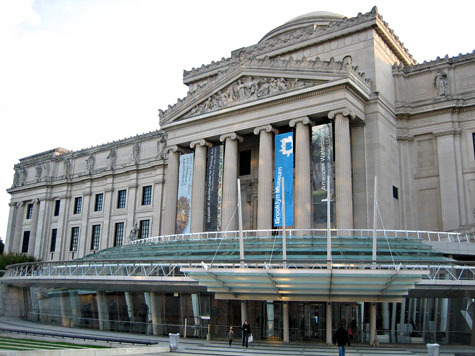
A lot of NY art folks have been tweeting of late about troubles (or perceived troubles) at the Brooklyn Museum. And as @cmonstah so aptly put it, today the Times published a selection of commentary on the topic "In which everyone and their mother offer the @brooklynmuseum some advice."
Though I'm no bit US or NYC museum-watcher, I thought the accompanying screeds—18 in all, from museum directors, artists and public administrators—had a lot of points to ponder for evaluating the success of any museum, including, ahem, Canadian ones.
Of course, because of my own views, I agreed with some of the comments more than others. Here's the ones that seemed to hit home for me, given my own, closer watching of access and measures-of-success issues at the AGO and the ROM, as well as getting a creeping feeling that a number of smaller local museums, like the Gardiner and the DX, are struggling with related problems:
MAXWELL L. ANDERSON, director of the Indianapolis Museum of Art :With a national average of 2 percent to 4 percent of art museum revenue coming from admissions, the distracting glitter of crowds is not as material to institutional health as most people assume. Instead of being evaluated for their contributions to research, preservation and education, art museums like the Brooklyn Museum are increasingly expected to be commercial attractions and economic engines.
The museum's future, like that of libraries, universities and other art museums beyond tourist meccas, lies in making a case for government, foundation and individual patronage by being a hotbed of creativity. Not by making a case for the box office.
Maxwell, you rock.
ANN PHILBIN, director of the Hammer Museum in Los Angeles :Attendance is simply one measure in a long list of priorities—some of which are very hard to quantify. For example, how does one measure the impact of showing a young artist for the first time and starting his or her career, or the ramifications of capturing the imaginations of young at-risk school groups?
Furthermore, how is attendance defined? At the Hammer we have begun to understand that our visitor numbers should not be limited to our own box office but might also include the hundreds of thousands of people aroun the world who log on to our Web site, hammer.ucla.edu, to view podcasts of our public programs, or the many thousands currently visiting the Charles Burchfield retrospective at the Whitney Museum of American Art, which the Hammer organized. Are these not all part of a measurable sphere of audience and influence?
Damn straight... I often feel like attendance is used as a measure of success just because it is easy to quantify.
ROCHELLE SLOVIN, director of the Museum of the Moving Image: What's bugging people about the Brooklyn Museum? Is there any good reason not to embrace First Saturdays? If international D.J.'s are O.K. for P.S.1 Contemporary Art Center, and string quartets are judged suitable for late nights at the Metropolitan Museum, then what exactly is the objection to hip-hop and salsa at the Brooklyn Museum? My advice to the Brooklyn Museum: Continue to take excellent care of your treasured collections, hang tough, and pile it on — more great exhibitions, more performances, more joyful noise.
Really love that point about "event bias" between different institutions.
KIKI SMITH, artist :Attendance is not necessarily a good measure of museum success. The quality of its collection, its administrative vision, the depth of its scholarly programming and its curatorial direction are. The nature of capitalism is dependent on growth, but it is not inherently in a museum's interest to expand.
Try telling that to the Vancouver Art Gallery, eh? Or if we could time-travel back, to the ROM and AGO and AGA, at least as a consideration.
Also, as an aside, Canada gets a shout out... though not in a good way!
GRAHAM W. J. BEAL, director of the Detroit Institute of Arts: Along with Brooklyn, the Museum of Fine Arts, Boston, and, increasingly, others, the Detroit Institute of Arts has been accused of "dumbing down" and "Disneyfication." I am, from time to time, described as leading the United States' most challenged institution, and it is true that we labor under many adverse conditions. But at least I do not have an art museum that is a world exemplar sitting across the river in Windsor, Ontario. Arnold is in an invidious position, and has tried to create a very different type of museum on the proverbial shoestring.
Still, Windsor semi-diss aside, I really recommend reading all the comments in the article. They show how many different ways there are of looking at and evaluating museums, as well as being passionate about them.
Image of the Brooklyn Museum from Obey
Tuesday, August 3, 2010
When a Review Doesn't Pass the Twitter Test: Drama & Desire at AGO, And Other Big-Insto Shows

On Friday, I realized that a review of mine that would be published in Saturday's National Post failed to pass the Twitter test. That is, a tweet-length summary of my feelings about the show doesn't quite match the published review that I wrote of it.
I realized this when @jgombita (Judy Gombita, a PR/networking gal on Twitter), asked me what I thought of the show on Friday. I tweeted (awful verb!) back, "Paintings = awesome (or at least "impt") Presentation = needs work." In a direct message, I also wrote "I think it needed a LOT more text or sound explanation to substantiate cheesier bits (wind machines, etc.)" and "Yeah the lit up painting was the most embarassing; the rest I could see as ok attempts at new-visitor engagement, but that was worst."
My review in the following day's paper was, I think, a bit gentler:
Promising to explore the ways that 1800s art mavericks were influenced by theatre, Drama & Desire contains many beautiful, internationally renowned paintings. (Jacques-Louis David’s Oath of the Horatii and John Singer Sargent’s Lady Macbeth are just a couple of examples.) Campy props — such as crystal chandeliers and old-fashioned wind machines — also add period zing. But in a bizarre plot twist, Drama & Desire forsakes one of the great joys of both art history and the stage: straight-up, old-fashioned storytelling. Most of these paintings were created to crystallize sprawling narratives, yet only a few have any accompanying explanation. (Even stranger, it’s the well-known stories, such as Romeo and Juliet, that actually get explained.) This lack leaves most viewers mystified about the actual dramas at hand. On a related note, true stories of class and gender are also AWOL. Many scholars note that 19th-century theatres often served gritty, lower-income audiences, and that even high-toned playhouses were hotbeds for prostitution. Degas (included in the show) actually tried to expose the tawdriness beneath theatre’s surface glitz. But Drama & Desire’s strategies merely amp that glamorous façade, leaning on theatre’s current status as elite entertainment and distancing viewers from the vital, vicious reality of the era it purports to immerse us in. Unintentional comedy? Gentle tragedy? Drama & Desire is both — and thanks to the fame of its paintings, it’s still a must-see.
Lesson learned: When trying to carve a review down to word count, I should perhaps consider what my Twitter summary would be first. Sans snark (or even avec), it can be a helpful thesis-statement exercise.
And yes, while I appreciated the attempt on the AGO's part to "enliven" the gallery experience with dramatic set design and devices, that lit-up painting I tweeted about (a scene from Shakespeare's King Lear accompanied by audio of Stratford actors speaking the scene's lines, with each painted character spotlighted while speaking) really did make me a bit squeamish. The strobed lightning on a painting of a stormy night also seemed a bit excessive and non-19th-century. What I enjoyed best was the variety of wall colours and seating, as well as the (yes!) wind machines. (They generate just the sound of the wind, not the motion.) The audio interview with an orchestra musician was also interesting. But overall, as I noted, all this needed supplementing by good old fashioned storytelling about the plots represented in the paintings, as well as the contexts of theatre and class in their respective eras.
You can also read my reviews of the Gardiner Museum's Private Pleasures and the Barnicke Gallery's Scream at the National Post. I'm open to any sentiments on these, long or shortly stated, that you might have.
Subscribe to:
Posts (Atom)
